預ける場所を売るのではなく、片づいた暮らしを売るには。
リニューアル前のLPは、料金や利便性といった機能的価値を中心に構成されていました。けれど、多忙な暮らしの中でこのサービスが本当に届けているのは、収納スペースそのものではなく、片づいた部屋の心地よさや、自分らしく過ごせる時間の余白です。
そこで訴求の起点を、企業が伝えたい情報から、利用者が実際に感じる価値へと移しました。情緒を入口に置き、機能や料金はその先で語る。読む順序そのものを設計し直しています。
そこで訴求の起点を、企業が伝えたい情報から、利用者が実際に感じる価値へと移しました。情緒を入口に置き、機能や料金はその先で語る。読む順序そのものを設計し直しています。
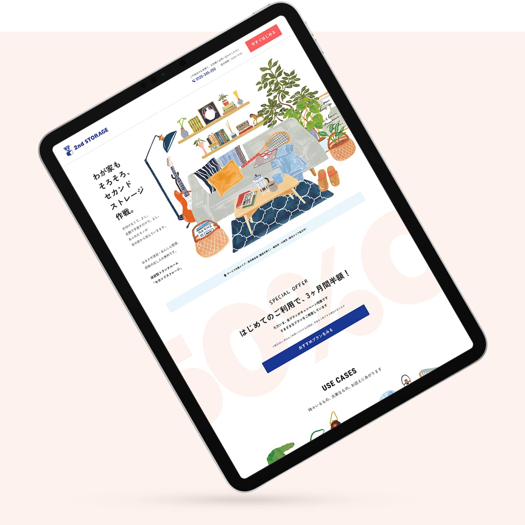
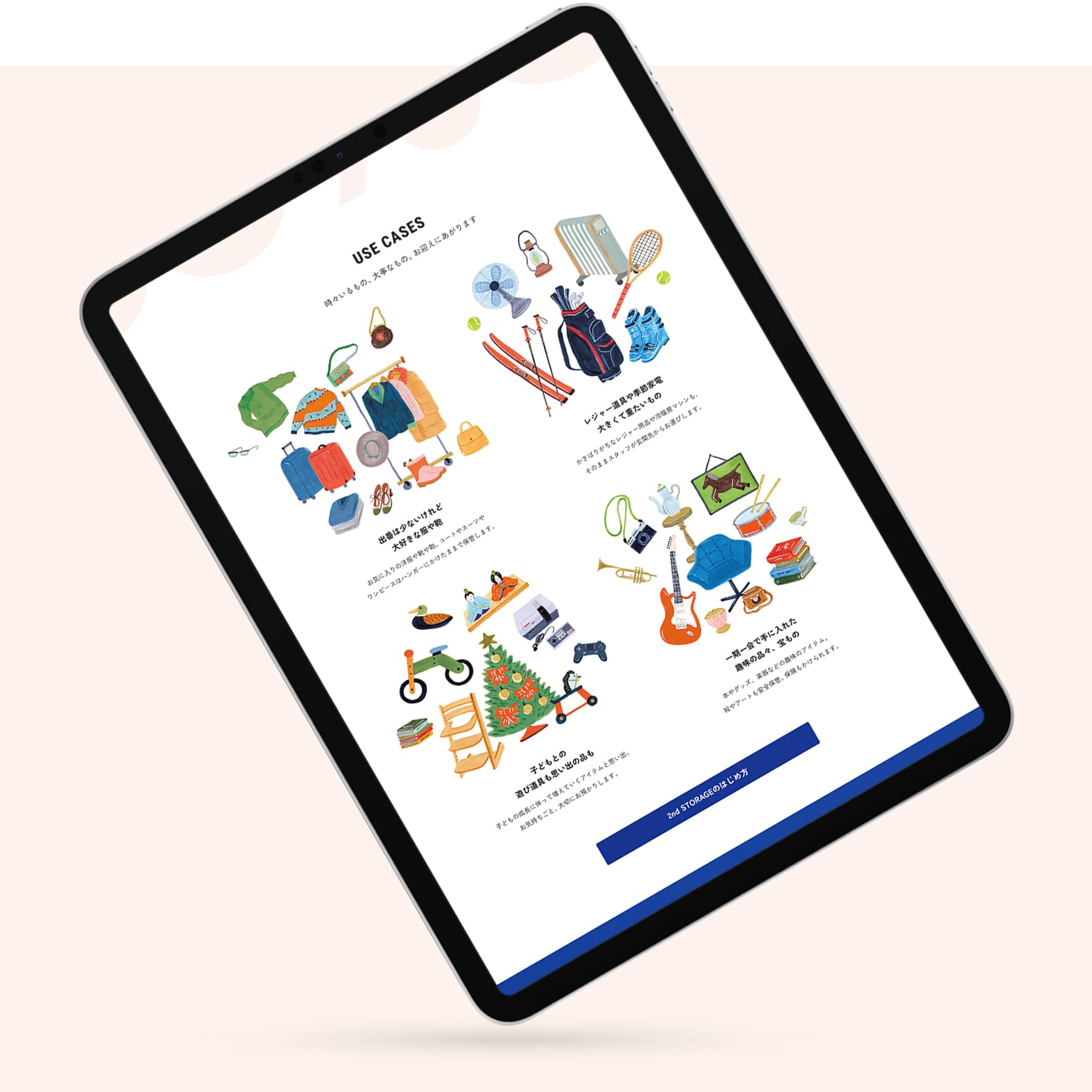
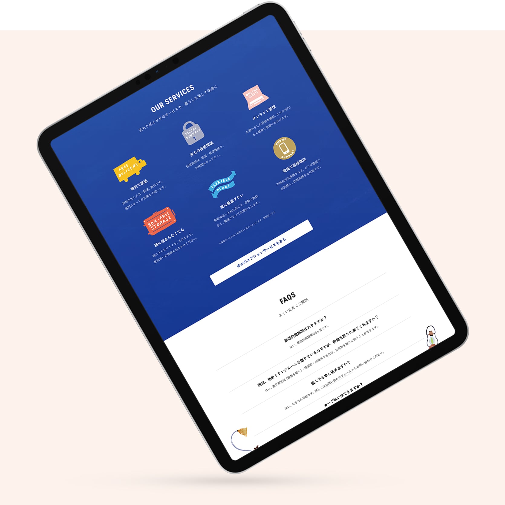
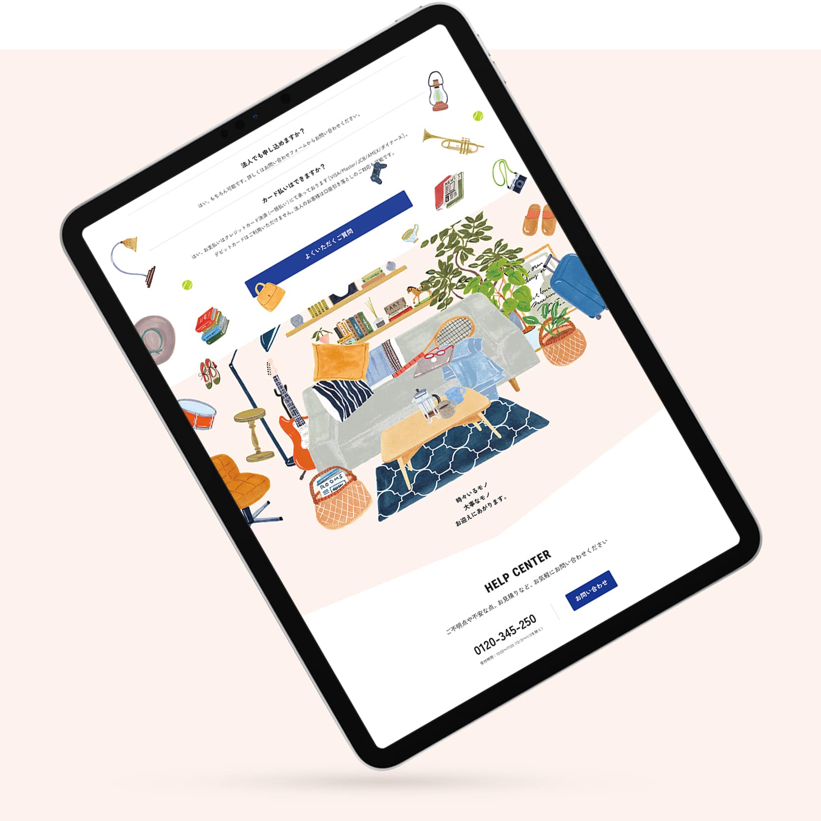
GEOグループが展開するトランクルームサービス「2nd STORAGE」のキャンペーンLPを制作しました。
サイト全体は、価格比較や機能説明に寄りすぎることなく、「このサービスがあることで暮らしがどう変わるか」を自然に想像できる構成を意識しています。コピーやイラストも、広告的な強さより、暮らしの延長として感じられる距離感を重視。ライフスタイル誌のようなトーンの中で、機能的価値と情緒的価値が無理なく共存する体験設計を行いました。
また、情報量が多くなりすぎないよう導線や動きも整理し、検討から行動までを滑らかにつなぐ構成としています。
The original landing page sold a service: pricing, plans, convenience. But what a storage service actually gives a busy household isn’t space in a warehouse — it’s a tidy room, and the time and ease that come with it. We moved the starting point of the message from what the company wants to say to what the user actually feels.
Emotional value leads; the practical detail follows. The page opens on the life the service makes possible, then moves the reader toward the campaign offer, real use cases, and the specifics of how it works — in that order. The tone is closer to a lifestyle magazine than a price comparison: warm, clear, and easy to trust.
The shift is small to describe and hard to do — from “here is what we offer” to “here is what your life could feel like” — without losing the concrete information a buyer still needs to decide.
サイト全体は、価格比較や機能説明に寄りすぎることなく、「このサービスがあることで暮らしがどう変わるか」を自然に想像できる構成を意識しています。コピーやイラストも、広告的な強さより、暮らしの延長として感じられる距離感を重視。ライフスタイル誌のようなトーンの中で、機能的価値と情緒的価値が無理なく共存する体験設計を行いました。
また、情報量が多くなりすぎないよう導線や動きも整理し、検討から行動までを滑らかにつなぐ構成としています。
The original landing page sold a service: pricing, plans, convenience. But what a storage service actually gives a busy household isn’t space in a warehouse — it’s a tidy room, and the time and ease that come with it. We moved the starting point of the message from what the company wants to say to what the user actually feels.
Emotional value leads; the practical detail follows. The page opens on the life the service makes possible, then moves the reader toward the campaign offer, real use cases, and the specifics of how it works — in that order. The tone is closer to a lifestyle magazine than a price comparison: warm, clear, and easy to trust.
The shift is small to describe and hard to do — from “here is what we offer” to “here is what your life could feel like” — without losing the concrete information a buyer still needs to decide.
Visit website — Japanese
Credits:
Producer: Miki Fukuda (Hito-Kurashi Lab)
Project Managers: Kaoru Chono & Rieko Nakanishi (602)
Director / Designer: Hideki Owa (PULP)
Technical Director / Engineer: Kouhei Yamamoto (eggraphix)
Copywriter: Aki Mineta
Illustrator: Grace Lee
Client: 2nd STORAGE (GEO Holdings Corporation)
November 2024
Previous / Home / Next