「らしさ」と「わかりやすさ」は、ちらかを削らずに両立できるか。
ホテル運営会社に求められる信頼性と、サンクリエイトらしい元気さ。このふたつは、ともすれば相反します。今回はその両立を、言葉で説明するのではなく、アートディレクションそのもので解くことを選びました。
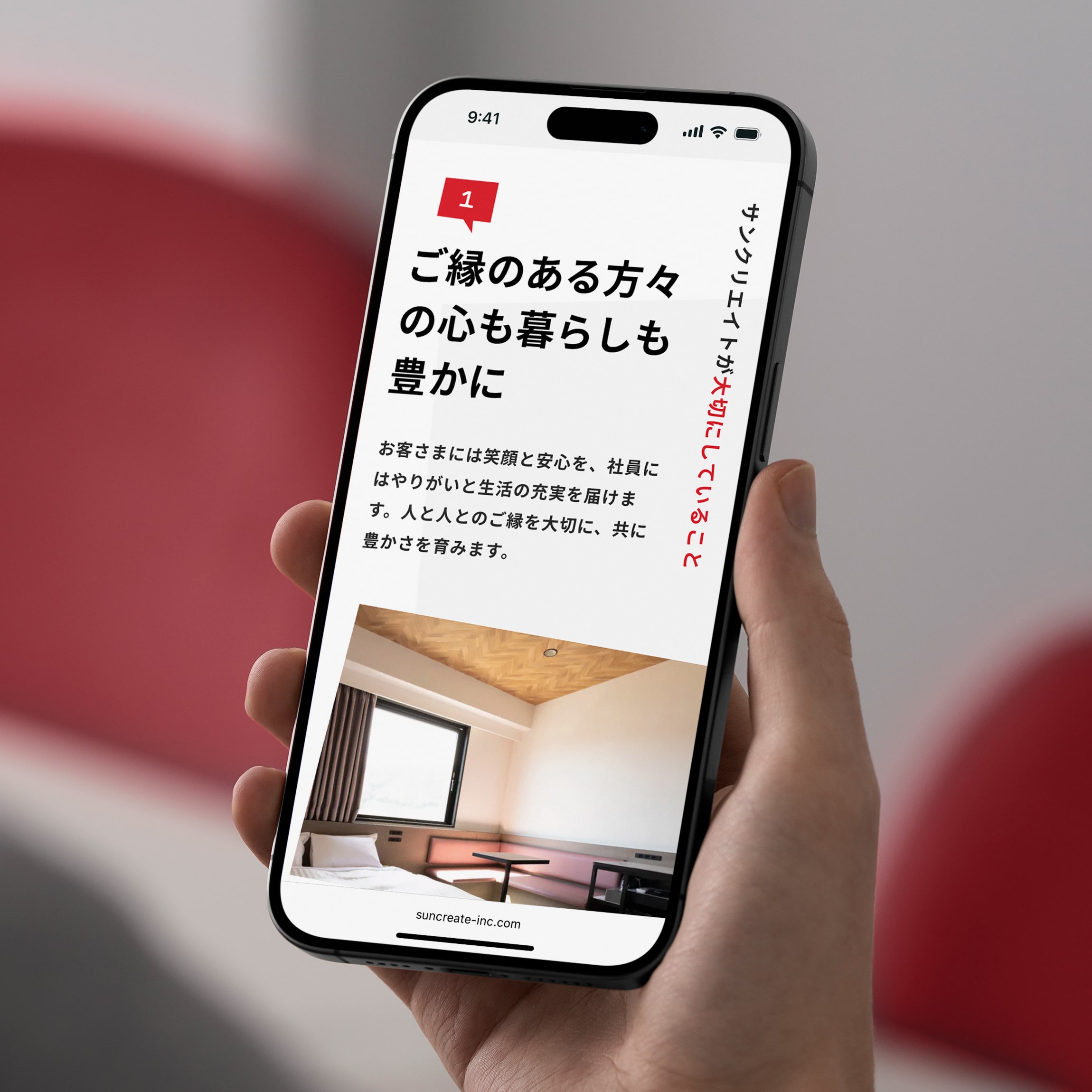
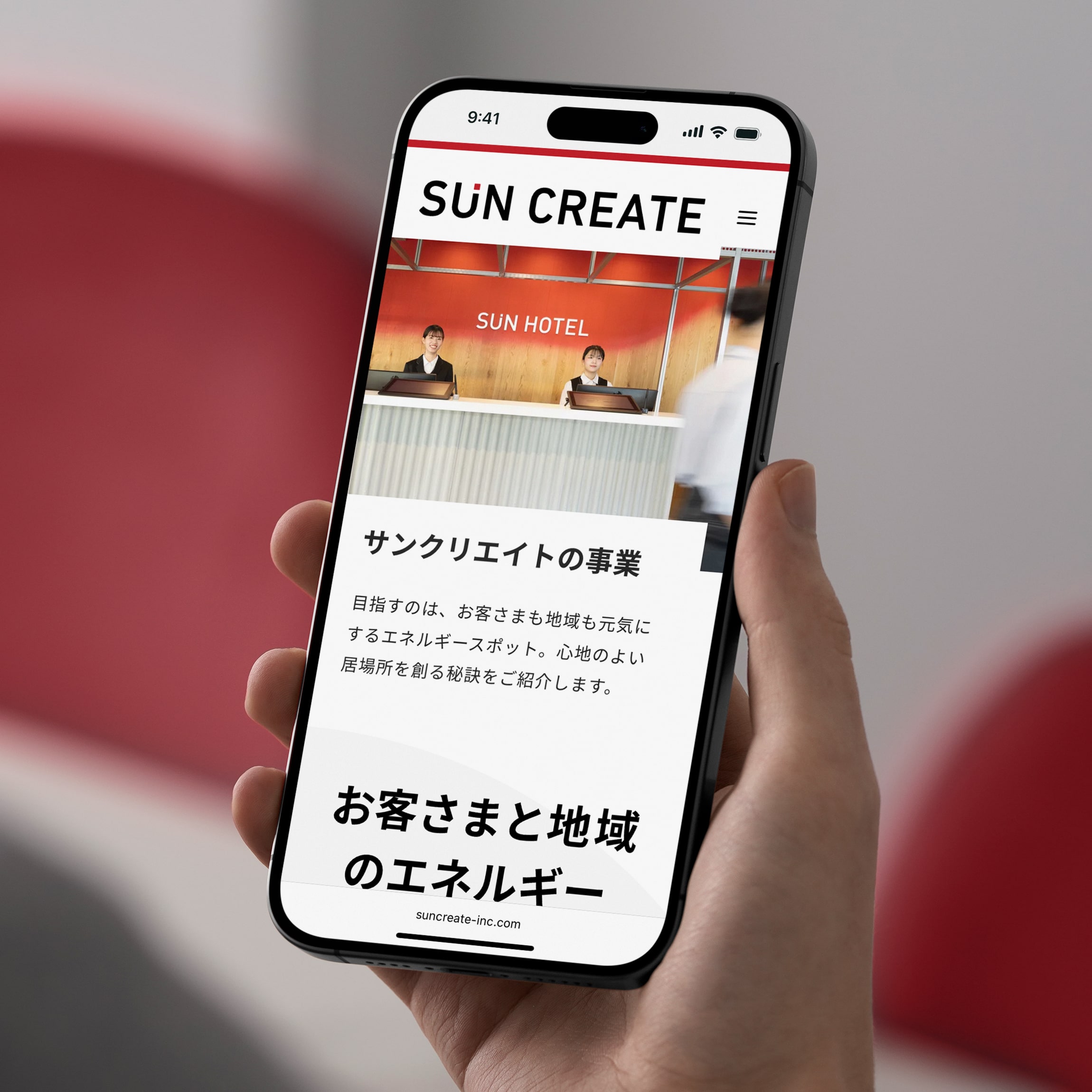
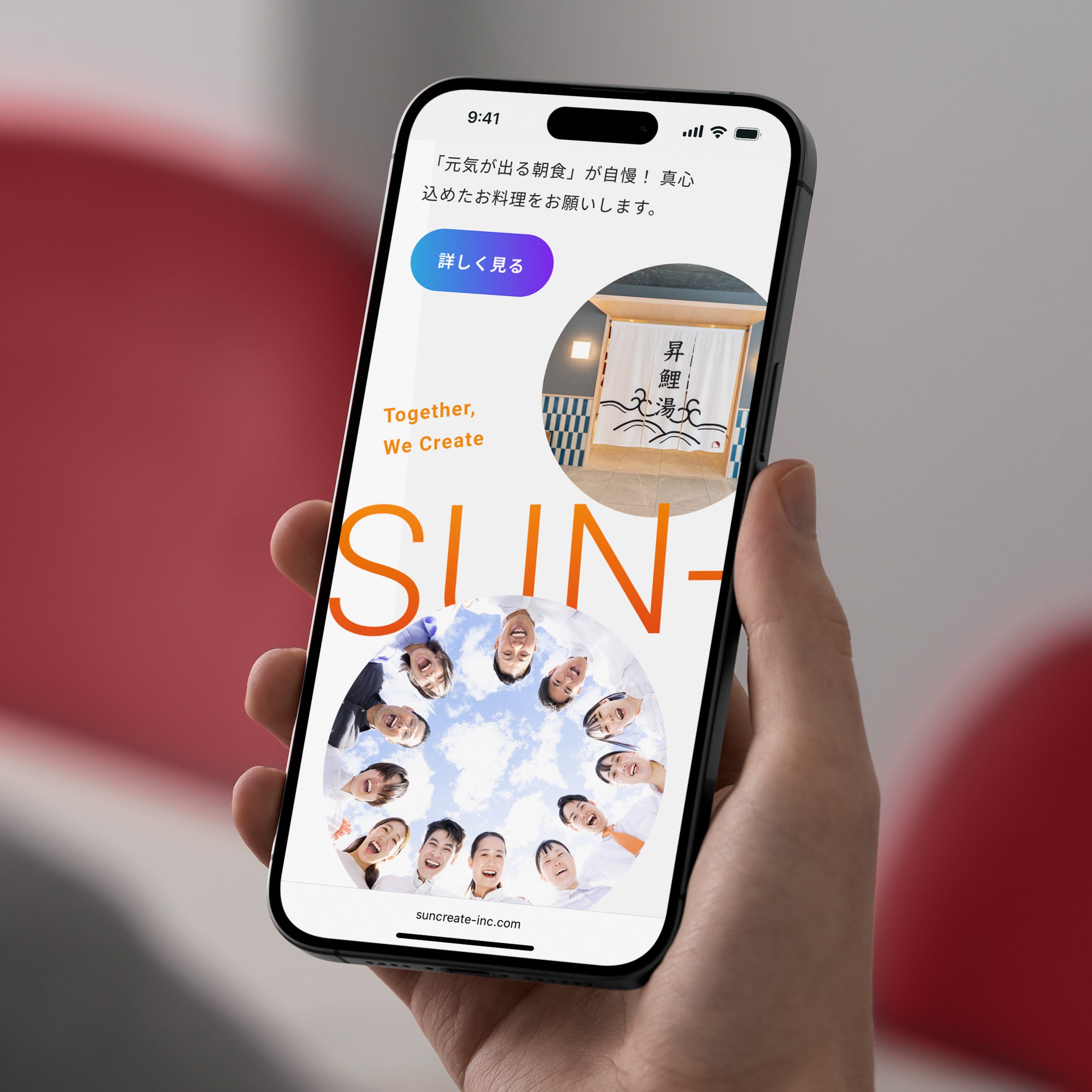
社名やホテル名に含まれる「SUN」を軸に、色彩、タイポグラフィ、レイアウト、リズムといったデザイン言語を整理。できるだけシンプルな構造の中で、明るさと信頼感が自然に共存する状態を目指しています。
社名やホテル名に含まれる「SUN」を軸に、色彩、タイポグラフィ、レイアウト、リズムといったデザイン言語を整理。できるだけシンプルな構造の中で、明るさと信頼感が自然に共存する状態を目指しています。
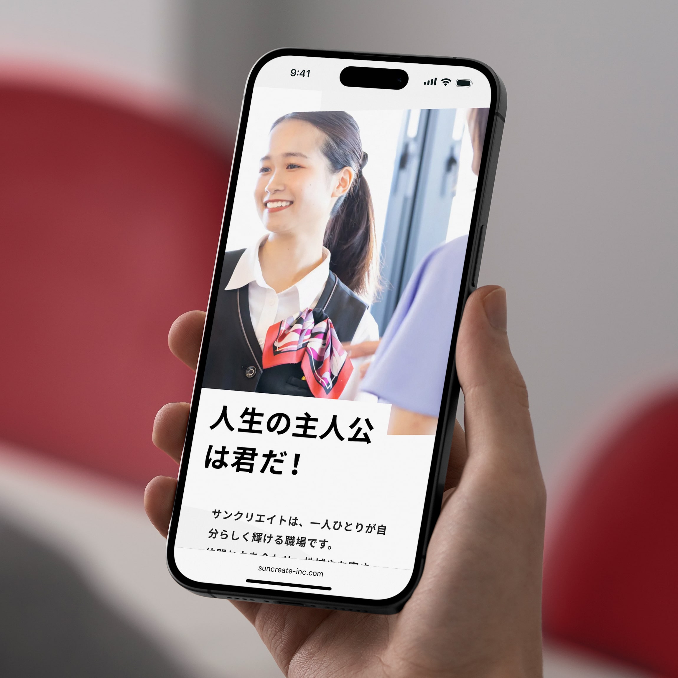
602様よりお声がけをいただき、ホテル運営会社・サンクリエイトのコーポレートWebサイトを制作しました。
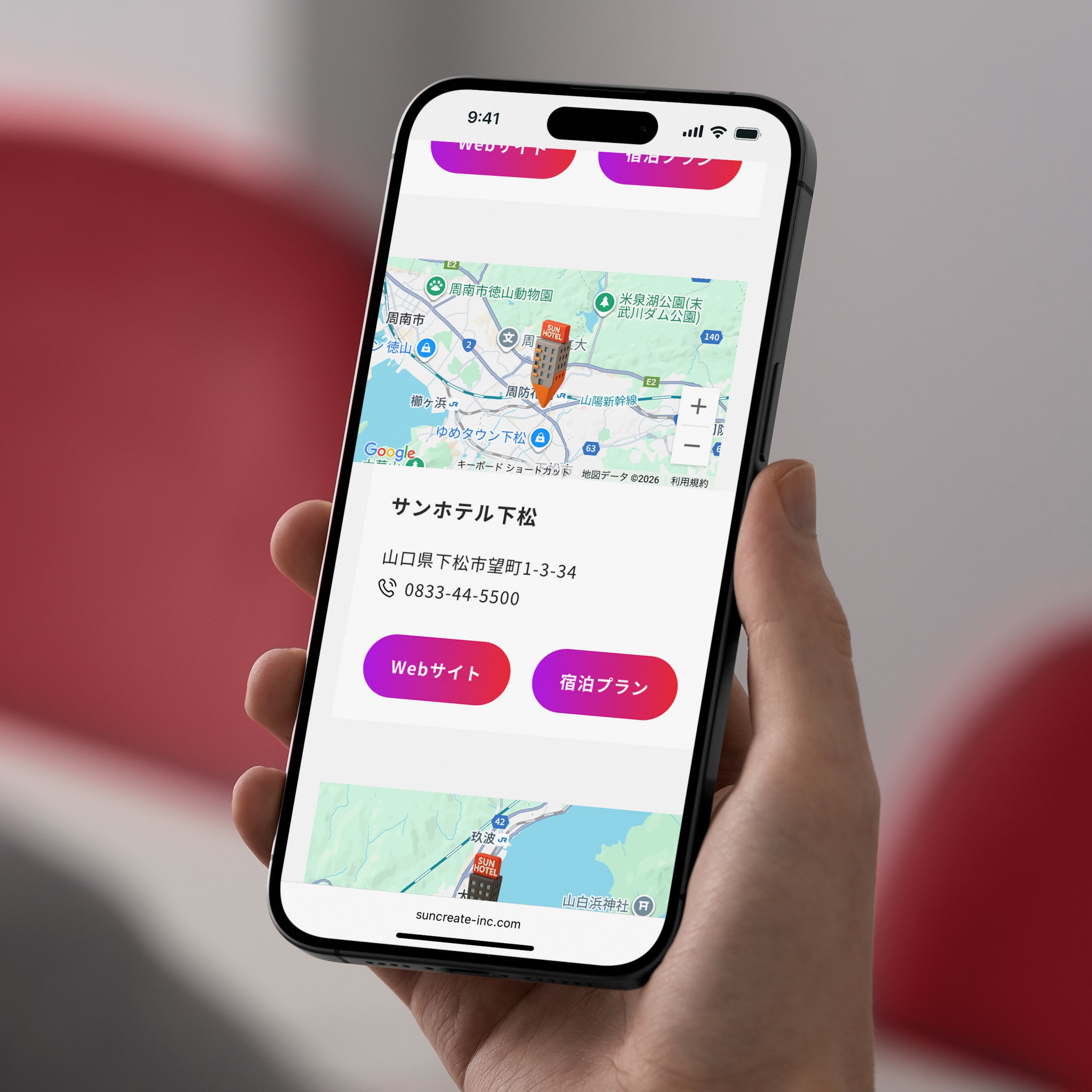
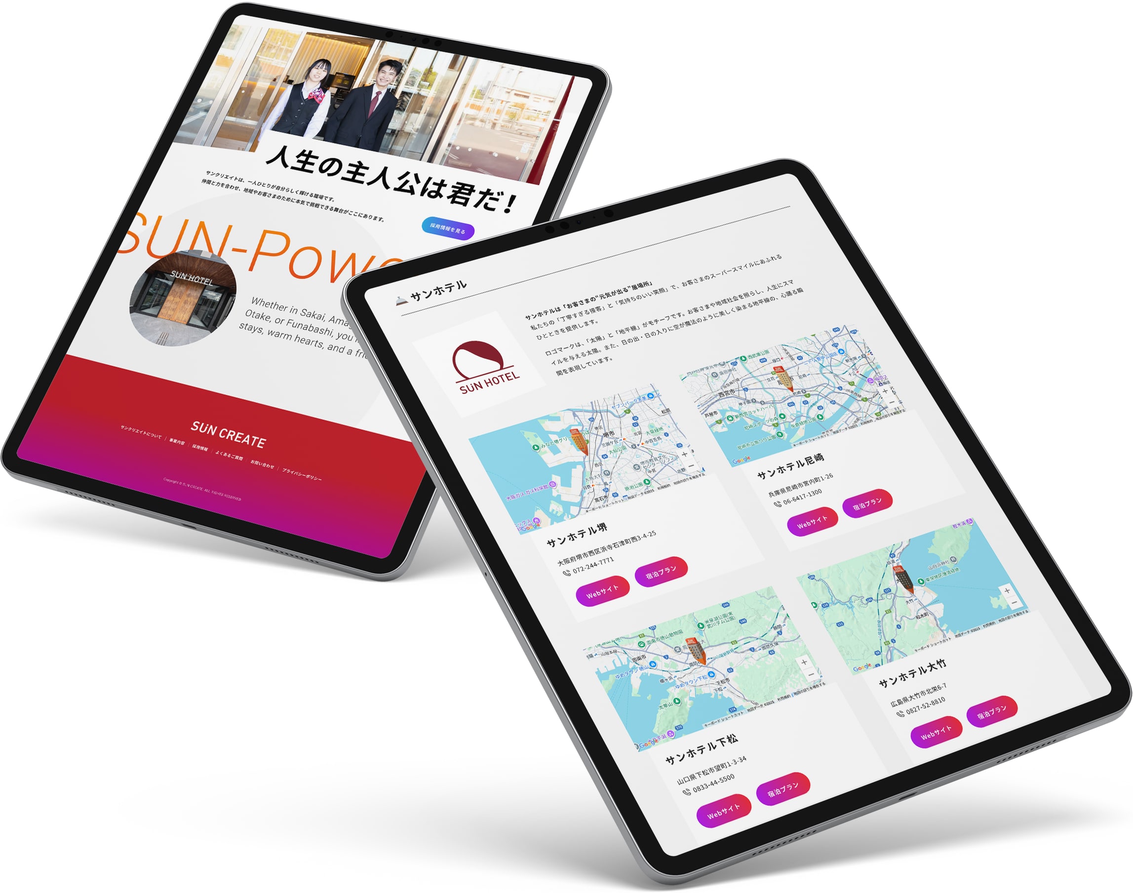
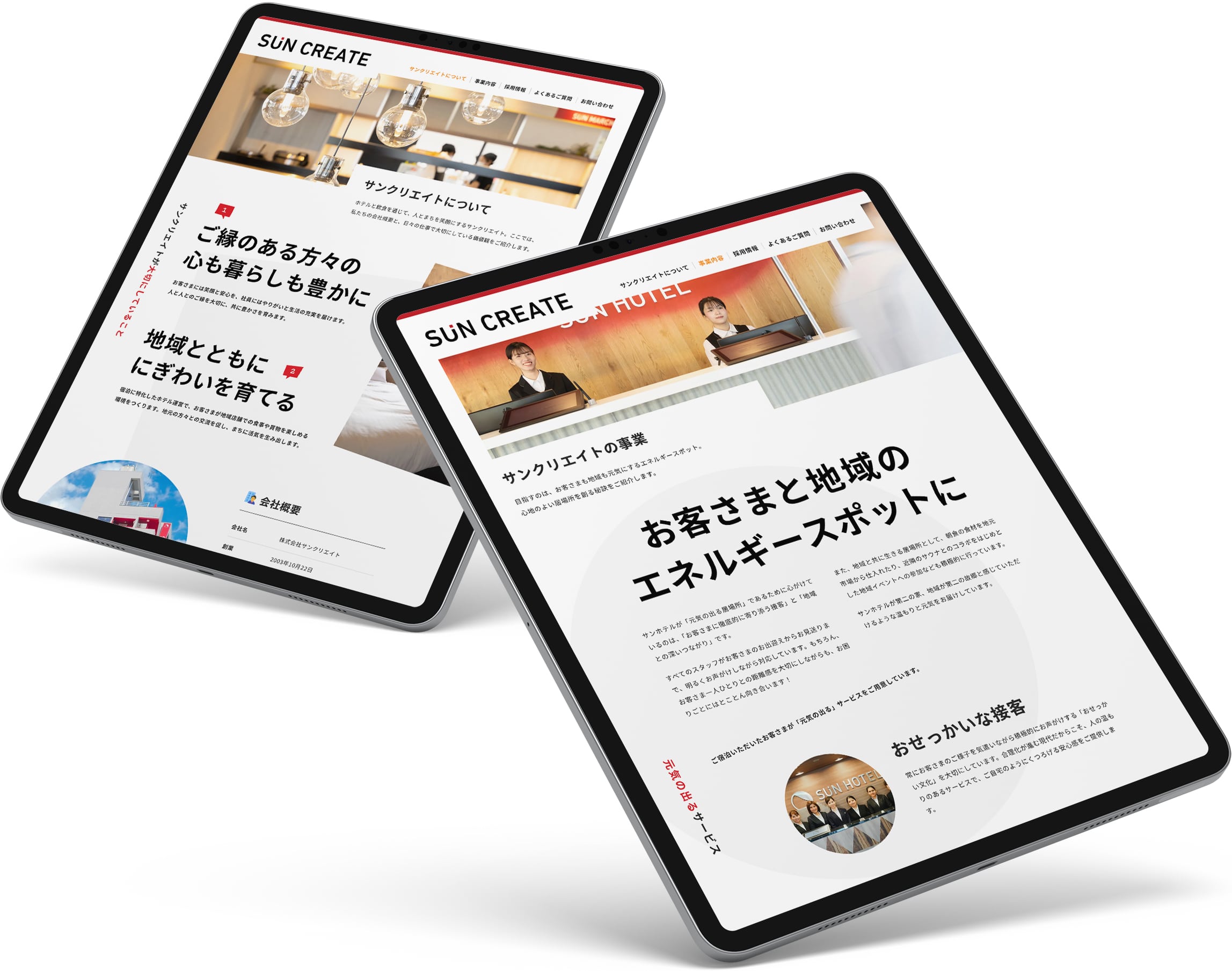
サイト全体では、視覚的な勢いや軽快さを持たせながらも、情報構造自体はシンプルに整理。事業内容や企業情報へ迷わずアクセスできる構成としています。
採用ページでは、全体のトーンとの連続性を保ちながら、少しだけ熱量を上げる方向へ調整。「ここで働きたい」と感じられる企業文化や空気感が、自然と伝わる設計を目指しました。
信頼感とエネルギー感。両立が難しいふたつの印象を、ひとつのデザイン言語としてまとめ上げることを試みたプロジェクトです。
サイト全体では、視覚的な勢いや軽快さを持たせながらも、情報構造自体はシンプルに整理。事業内容や企業情報へ迷わずアクセスできる構成としています。
採用ページでは、全体のトーンとの連続性を保ちながら、少しだけ熱量を上げる方向へ調整。「ここで働きたい」と感じられる企業文化や空気感が、自然と伝わる設計を目指しました。
信頼感とエネルギー感。両立が難しいふたつの印象を、ひとつのデザイン言語としてまとめ上げることを試みたプロジェクトです。
A hotel operator needs to look trustworthy. A company people want to join needs to look alive. Usually those two pull against each other — lean toward trust and it turns stiff; lean toward energy and it turns light. Sun Create needed both at once.
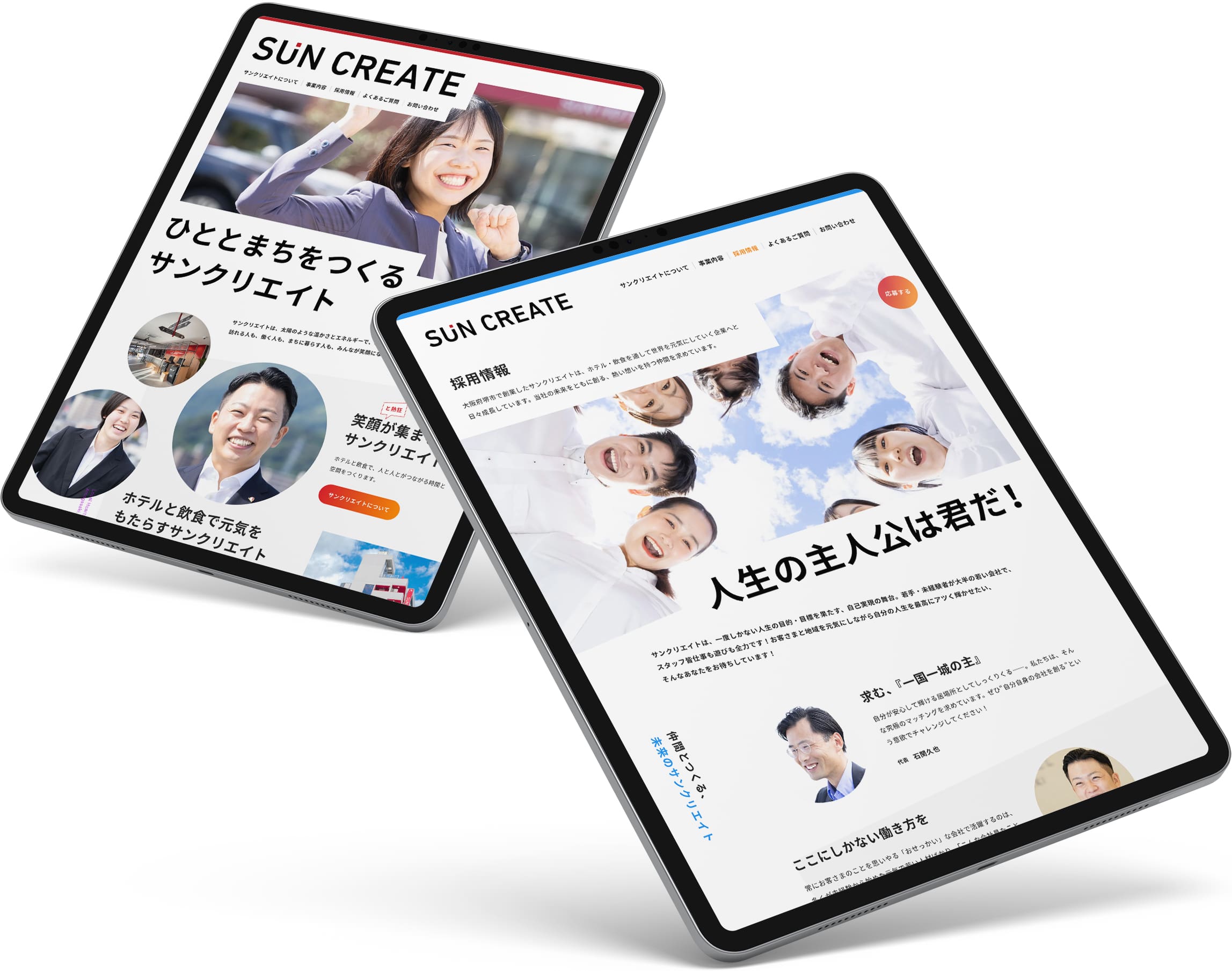
We chose to resolve that tension through art direction rather than explanation — not by writing “we are reliable and energetic,” but by making the design itself carry both. Built around the sun in the company’s name, color, typography, layout, and rhythm were tuned to read as bright and forward-moving the moment the page opens, while the information underneath stays simple and easy to navigate.
For recruiting, the palette turns from red to a cooler blue — the hotter flame, not the softer one. Energy rises, composure holds.
Two impressions that rarely sit together — trust and energy — hold in a single, coherent face.
We chose to resolve that tension through art direction rather than explanation — not by writing “we are reliable and energetic,” but by making the design itself carry both. Built around the sun in the company’s name, color, typography, layout, and rhythm were tuned to read as bright and forward-moving the moment the page opens, while the information underneath stays simple and easy to navigate.
For recruiting, the palette turns from red to a cooler blue — the hotter flame, not the softer one. Energy rises, composure holds.
Two impressions that rarely sit together — trust and energy — hold in a single, coherent face.
Visit website — Japanese
Credits:
Producer: Kaoru Chono (602)
Project Managers: Kaoru Chono & Rieko Nakanishi (602)
Director / Designer: Hideki Owa (PULP)
Technical Director / Engineer: Kouhei Yamamoto (eggraphix)
Copywriters: Ikuko Noda & PULP
Photographer: Tomoaki Makino
Client: Sun Create
October 2025
Previous / Home / Next