伝えたいことが多すぎる。そのとき、何を削れば、いちばん伝わるのか。
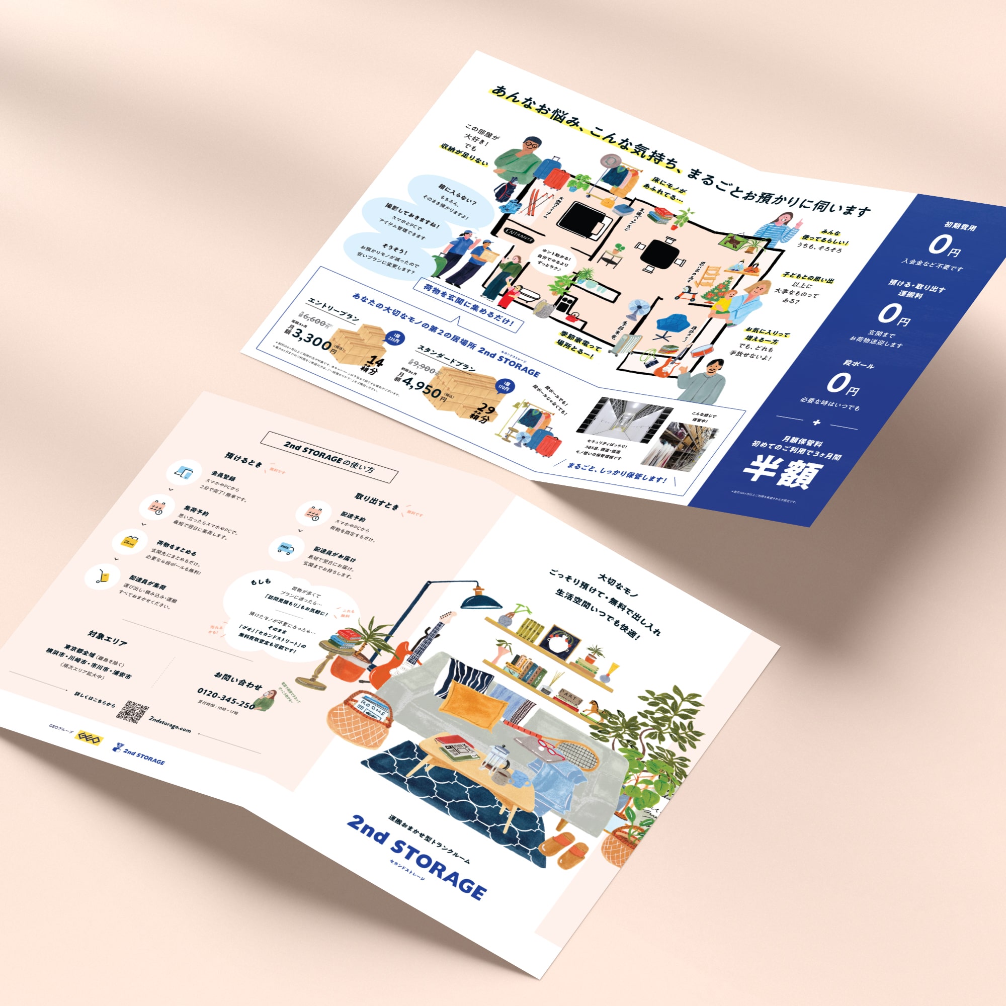
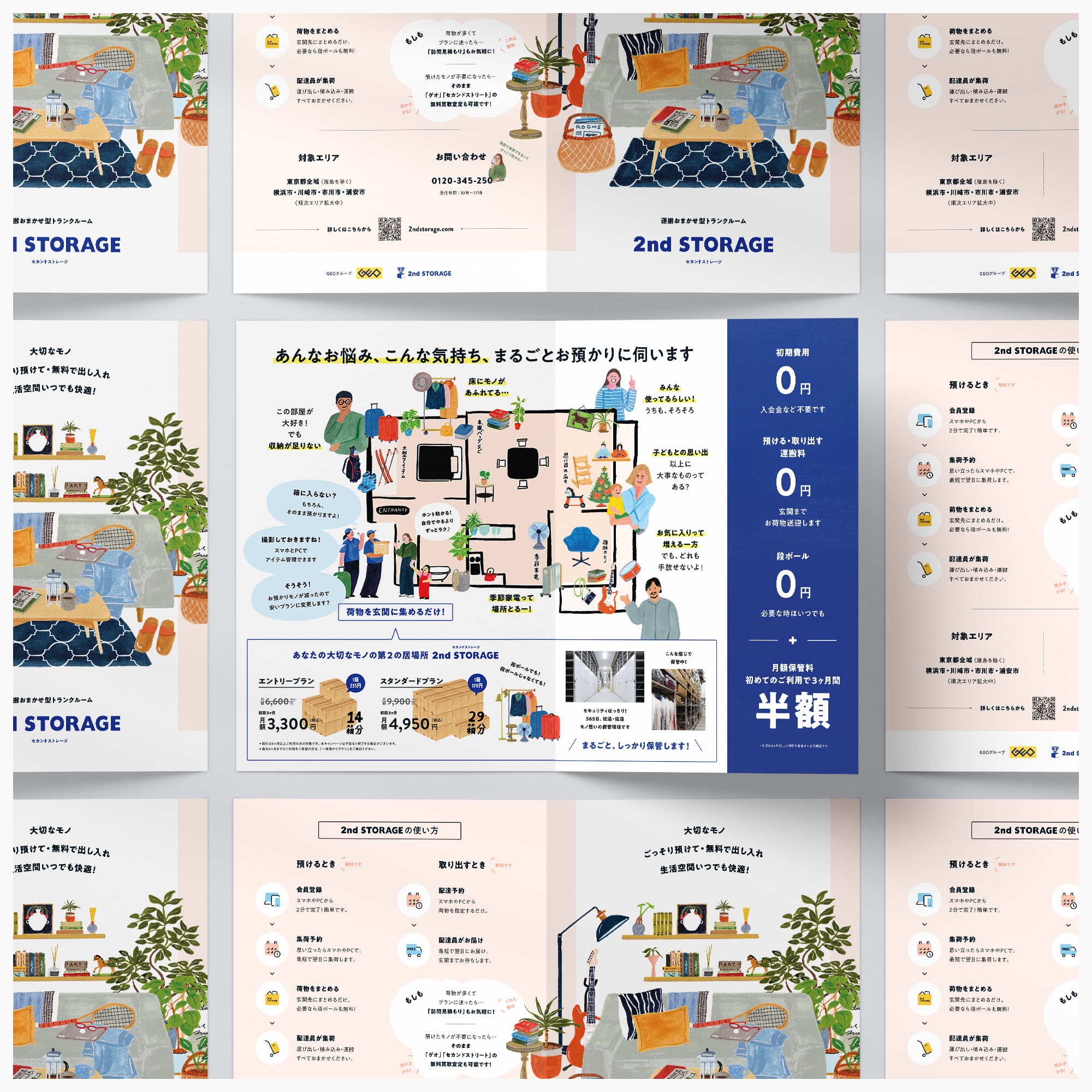
リニューアルの出発点は、「伝えたいことが多すぎて散漫になっている」という課題でした。そこで、一枚のリーフレットを「なぜ使うのか」「何ができるのか」「どう始めるのか」という三つの役割に整理。それぞれの面に、ひとつの目的だけを持たせています。
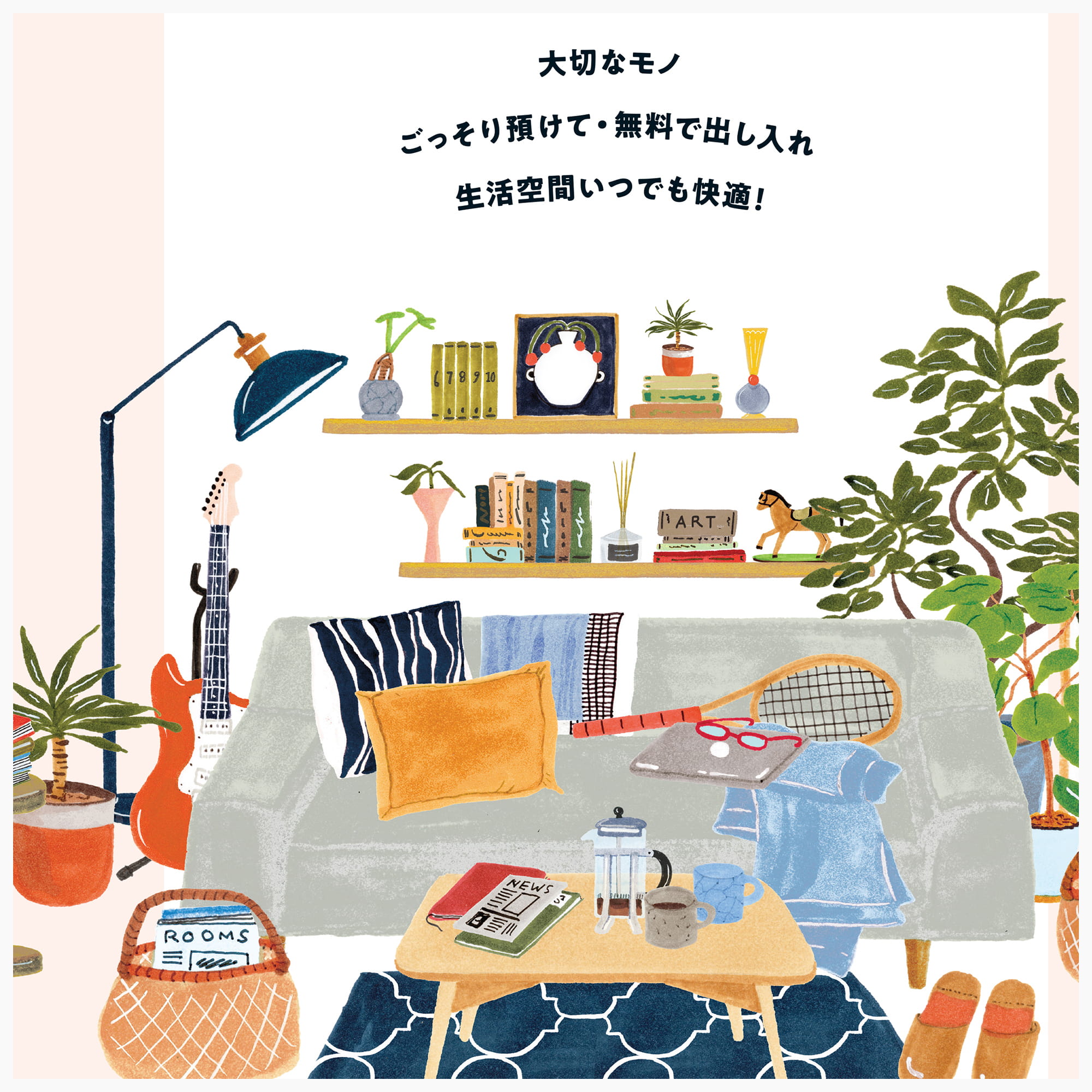
すべてを均等に説明するのではなく、読む順序そのものを設計する。最初の面では、あえて機能を語らず、「自分の暮らしに関係ありそうだ」と感じてもらうことを優先しました。
![]()
2024年度のキャンペーンWebサイトと連動し、イベント会場や各種タッチポイントで配布するリーフレットを制作しました。
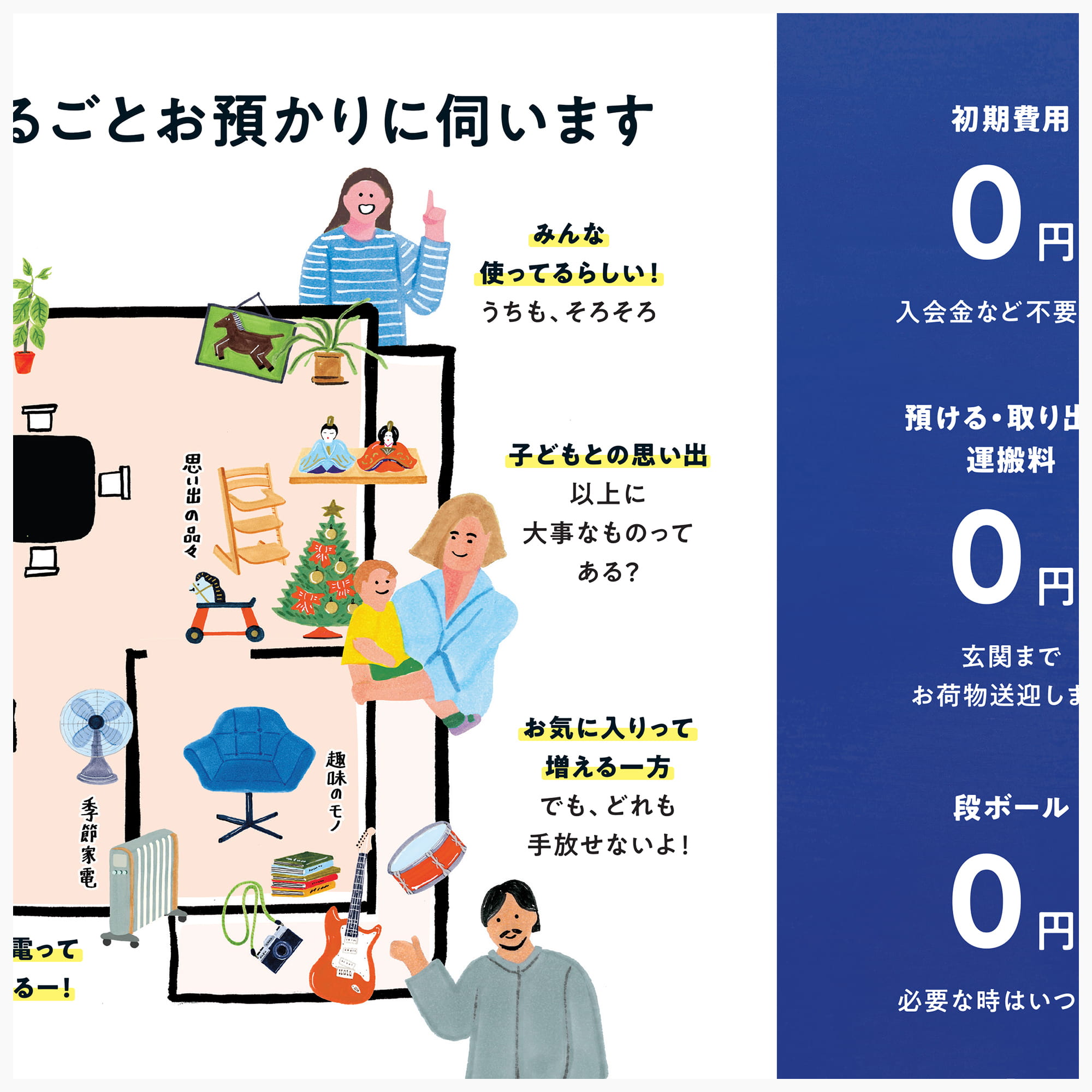
イラストは、収納を特別な行為としてではなく、暮らしの延長として自然に想像できる距離感を意識。情報設計も要点を絞り込み、初めての方でも無理なく理解できる構成としています。
Webと紙、それぞれの役割を整理しながら、一貫したブランド体験を設計したプロジェクトです。
The problem wasn’t too little to say. It was too much. The earlier material tried to tell everyone everything, and as a result, few people opened it at all.
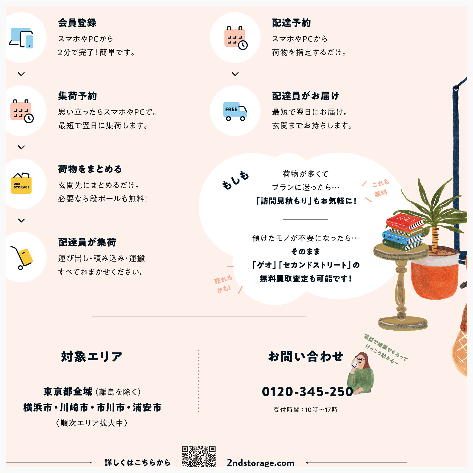
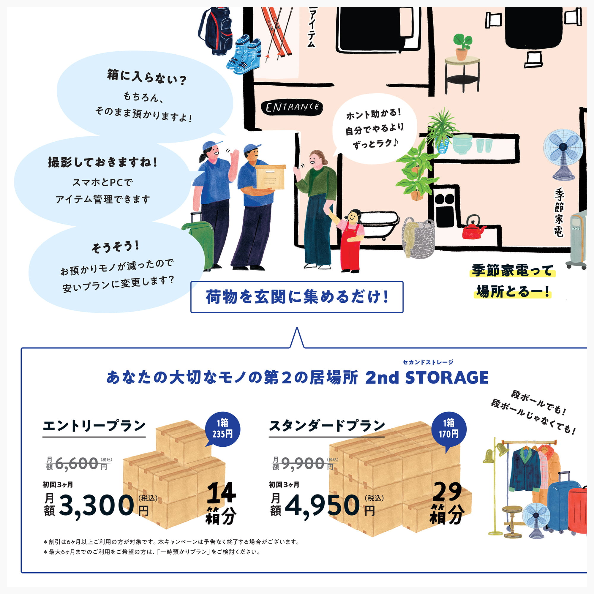
So we gave the single sheet a single job per side. The front carries only the reason to pick it up — the emotional pull, nothing functional. The inside holds the substance: features, safety, pricing. The back closes with how to start and where to ask. Rather than weighting everything equally, we designed the order in which a reader meets it — and deliberately said nothing about function on the first face they see.
Connected to the 2024 campaign site, the leaflet carries the same world onto paper, using illustration that settles into everyday life so that a first-time reader can picture the service as their own.
すべてを均等に説明するのではなく、読む順序そのものを設計する。最初の面では、あえて機能を語らず、「自分の暮らしに関係ありそうだ」と感じてもらうことを優先しました。
2024年度のキャンペーンWebサイトと連動し、イベント会場や各種タッチポイントで配布するリーフレットを制作しました。
イラストは、収納を特別な行為としてではなく、暮らしの延長として自然に想像できる距離感を意識。情報設計も要点を絞り込み、初めての方でも無理なく理解できる構成としています。
Webと紙、それぞれの役割を整理しながら、一貫したブランド体験を設計したプロジェクトです。
The problem wasn’t too little to say. It was too much. The earlier material tried to tell everyone everything, and as a result, few people opened it at all.
So we gave the single sheet a single job per side. The front carries only the reason to pick it up — the emotional pull, nothing functional. The inside holds the substance: features, safety, pricing. The back closes with how to start and where to ask. Rather than weighting everything equally, we designed the order in which a reader meets it — and deliberately said nothing about function on the first face they see.
Connected to the 2024 campaign site, the leaflet carries the same world onto paper, using illustration that settles into everyday life so that a first-time reader can picture the service as their own.
Credits:
Producer: Miki Fukuda (Hito-Kurashi Lab)
Project Managers: Kaoru Chono & Rieko Nakanishi (602)
Director / Designer: Hideki Owa (PULP)
Copywriter: Aki Mineta
Illustrator: Grace Lee
Client: 2nd STORAGE (GEO Holdings Corporation)
November 2024
Previous / Home / Next