PULPは、ブランドコミュニケーションとデジタル領域を横断するクリエイティブスタジオです。Webサイトやデジタルプロダクト、CI/VI、映像まで、企画・戦略設計からデザイン、実装までを一貫してディレクションしています。
近年、制作のスピードは飛躍的に向上しました。AIやノーコードの進化により、アウトプットは増え続けています。しかし、企業の成長を止めているのはアイデア不足ではありません。多くの場合、それは「判断の軸」が曖昧になっていることだと考えています。
欧米では1990年代以降、Creative DirectorやChief Creative Officer(CCO)を経営機能として設置することが一般化しました。ブランドとプロダクトを横断し、判断を統合する役割です。一方、日本では制作機能は存在していても、経営とデザインを接続するポジションはまだ多いとは言えません。その結果、改善が機能単位で分断され、経営と制作の間に判断を整理する存在が不在になることがあります。
PULPの役割は、戦略から実装までを設計しながら、「何をやるか」だけでなく「何をやらないか」までを含めて判断軸を整えることにあります。構想段階から関与し、経営の言語をデザインへ翻訳し、デザインの構造を経営へと接続する。制作は、その判断を形にするプロセスです。
現在は制作案件と並行しながら、外部クリエイティブディレクターとして企業に伴走しています。事業フェーズや組織規模に応じて、戦略設計支援やブランド構造の整理、プロダクト横断レビュー、判断基準の言語化を通じて、意思決定の軸を整えています。
つくること自体が難しくなくなった時代において、重要なのは量ではなく判断の質です。その判断を実装まで貫き、責任を持って形にする。それがPULPの現在地です。
In an era when anyone can produce, judgment is what remains scarce.
AI and no-code tools have made output faster and cheaper than ever. Yet what holds most organizations back is not a shortage of ideas, but the absence of a clear basis for deciding what to build — and what to leave out.
Since the 1990s, Western companies have treated creative leadership as a management function, installing Creative Directors and Chief Creative Officers to align decisions across brand and product. In Japan, production capability is everywhere, but the role that connects business and design — the role that resolves judgment at the center — remains rare. Improvements stay siloed, with no one responsible for aligning them into a coherent whole.
That gap is where PULP works.
PULP is a Tokyo-based creative studio operating across brand, digital, and product. We direct the full arc — from strategic foundation through design to implementation — but the real work happens upstream: translating the language of business into design, and the structure of design back into business. We define the principles behind what gets made, and just as deliberately, what does not.
PULP operates as a single, consistent point of judgment — assembling the right team of specialists around each project while keeping creative direction coherent from first principle to final detail. Today, that often means working alongside clients as an external creative director: clarifying brand structure, reviewing products and experiences holistically, and putting decision-making criteria into words.
Making things is no longer the hard part. Deciding well is. That is where PULP stands today.
Company Info
Notes & Thoughts on note

1. Philosophy
長く機能し、信頼を育てるデザインをつくります。
一時的な成果ではなく、使われ続けることを前提に設計します。
We create design that lasts — building trust that grows over time.
2. Process
「観察」「構造」「言葉」を軸に、本質を捉え、判断の基準を整えるプロセスを大切にしています。
Our process is grounded in observation, structure, and language — clarifying the principles behind decisions.
3. Collaboration
クライアントクライアントやパートナーとともに、目的や前提を共有しながら、最適なかたちを探っていきます。
We work collaboratively, aligning purpose and context before shaping outcomes.
4. Approach
プロジェクトの内容やフェーズに応じて最適な方法をご提案し、完成後も継続的に伴走します。
Each engagement is tailored to its context and phase — with clear scope, timeline, and ongoing support.
5. Careers / Partnerships
プロジェクトの考え方に共感し、ともに考え、判断し、かたちにしていく仲間を歓迎します。
We welcome collaborators who value thoughtful work and meaningful outcomes.
∵長く機能し、信頼を育てるデザインをつくります。
一時的な成果ではなく、使われ続けることを前提に設計します。
We create design that lasts — building trust that grows over time.
2. Process
「観察」「構造」「言葉」を軸に、本質を捉え、判断の基準を整えるプロセスを大切にしています。
Our process is grounded in observation, structure, and language — clarifying the principles behind decisions.
3. Collaboration
クライアントクライアントやパートナーとともに、目的や前提を共有しながら、最適なかたちを探っていきます。
We work collaboratively, aligning purpose and context before shaping outcomes.
4. Approach
プロジェクトの内容やフェーズに応じて最適な方法をご提案し、完成後も継続的に伴走します。
Each engagement is tailored to its context and phase — with clear scope, timeline, and ongoing support.
5. Careers / Partnerships
プロジェクトの考え方に共感し、ともに考え、判断し、かたちにしていく仲間を歓迎します。
We welcome collaborators who value thoughtful work and meaningful outcomes.
お問い合わせやご相談は、 info@pulp.jp までお気軽にご連絡ください。
まずは対話から始められればうれしく思います。
For inquiries or collaborations, please contact us at info@pulp.jp.
Previous / Home / Next
年に3度、姿を変える大会を、ひとつのサイトとして機能させ続けるには。
最初に決めたのは、デザインではなく判断の拠り所でした。春・夏・秋で姿を変える大会を、一度きりの完成形ではなく、季節ごとに手を入れながら使い続けられる構造として設計する。来場者がどの大会の、どの情報や窓口へも迷わずたどり着けるよう、複数のチャネルを束ねて整理する。多言語対応や実装方針も、その判断軸からの帰結でした。

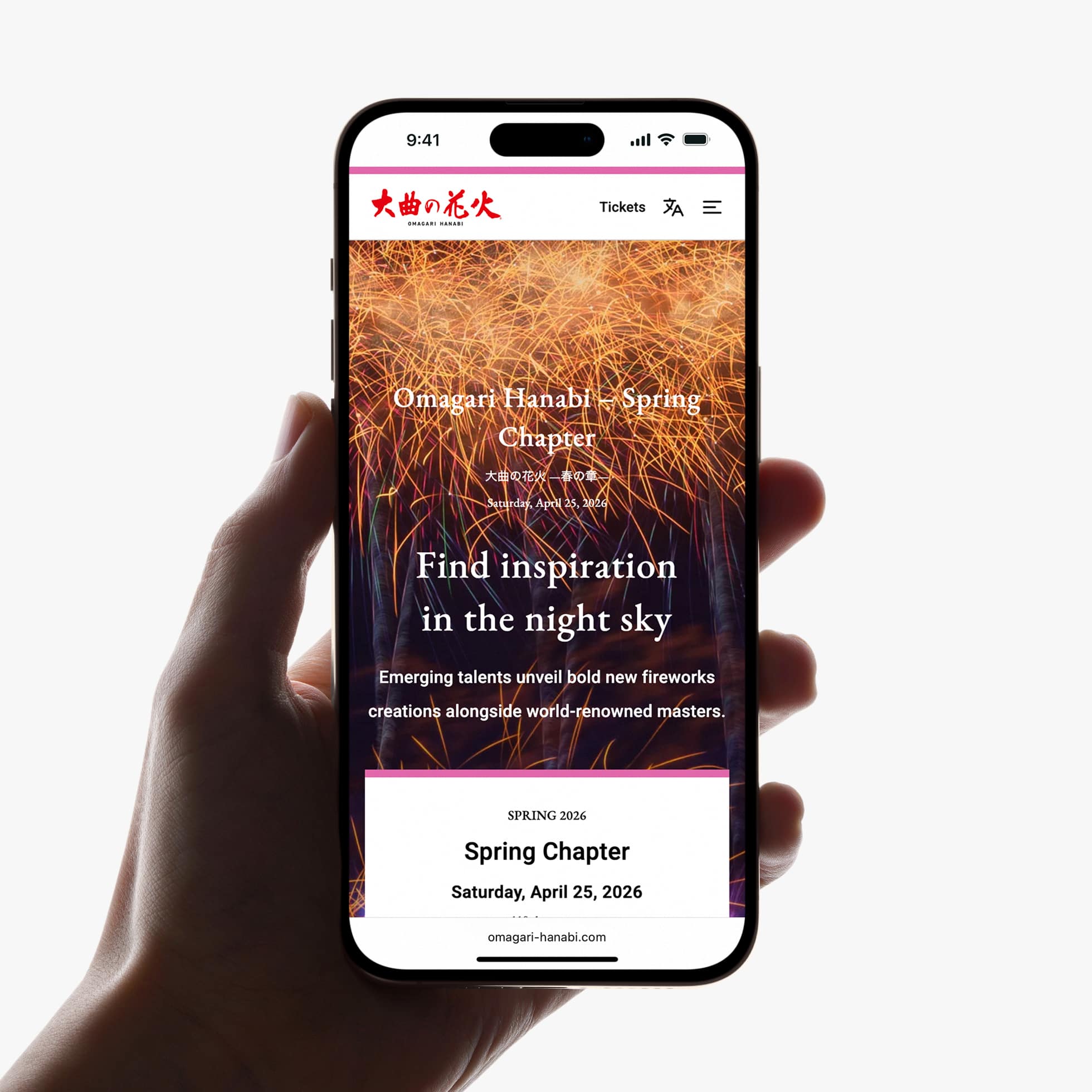
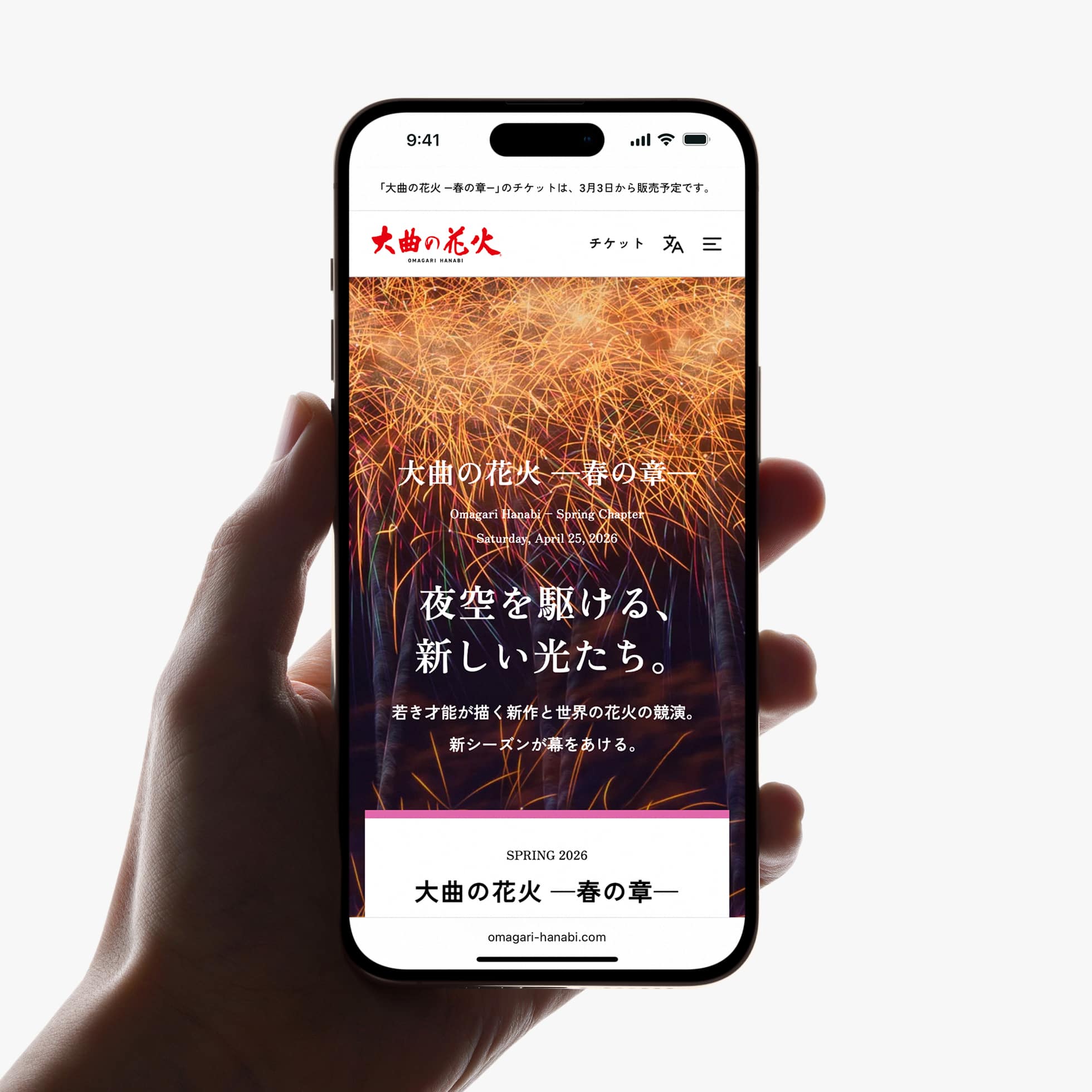
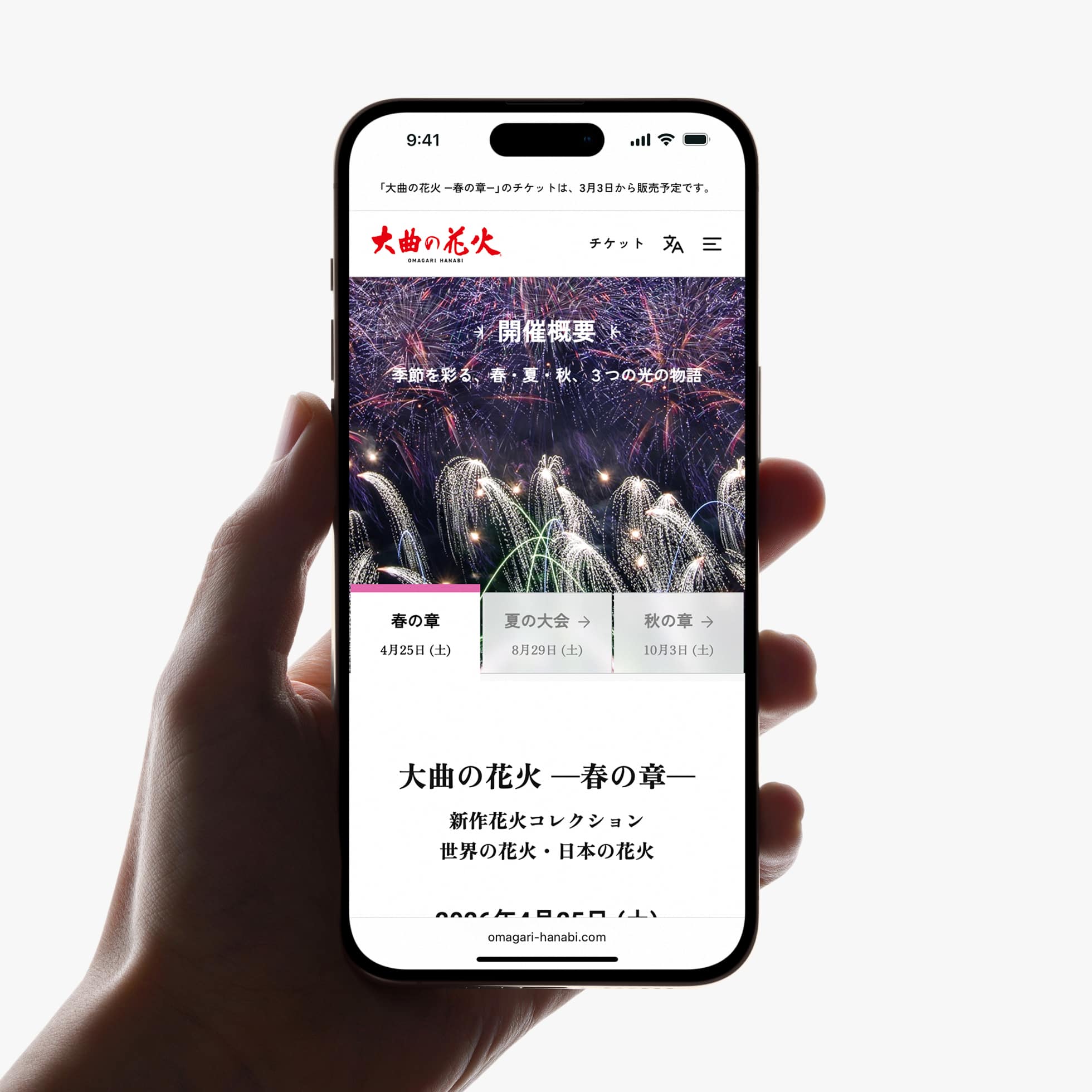
「大曲の花火」は、秋田県大仙市大曲で春・夏・秋に開催される3つの花火大会の総称です。PULPは公式Webサイトのリニューアルにあたり、企画、コンテンツ開発、UX・UIデザイン、実装までを一貫してディレクションしました。
目指したのは、魅力を伝えるだけではなく、来場者が必要な情報に迷わずたどり着き、安心して大会へ参加できる情報体験をつくることでした。
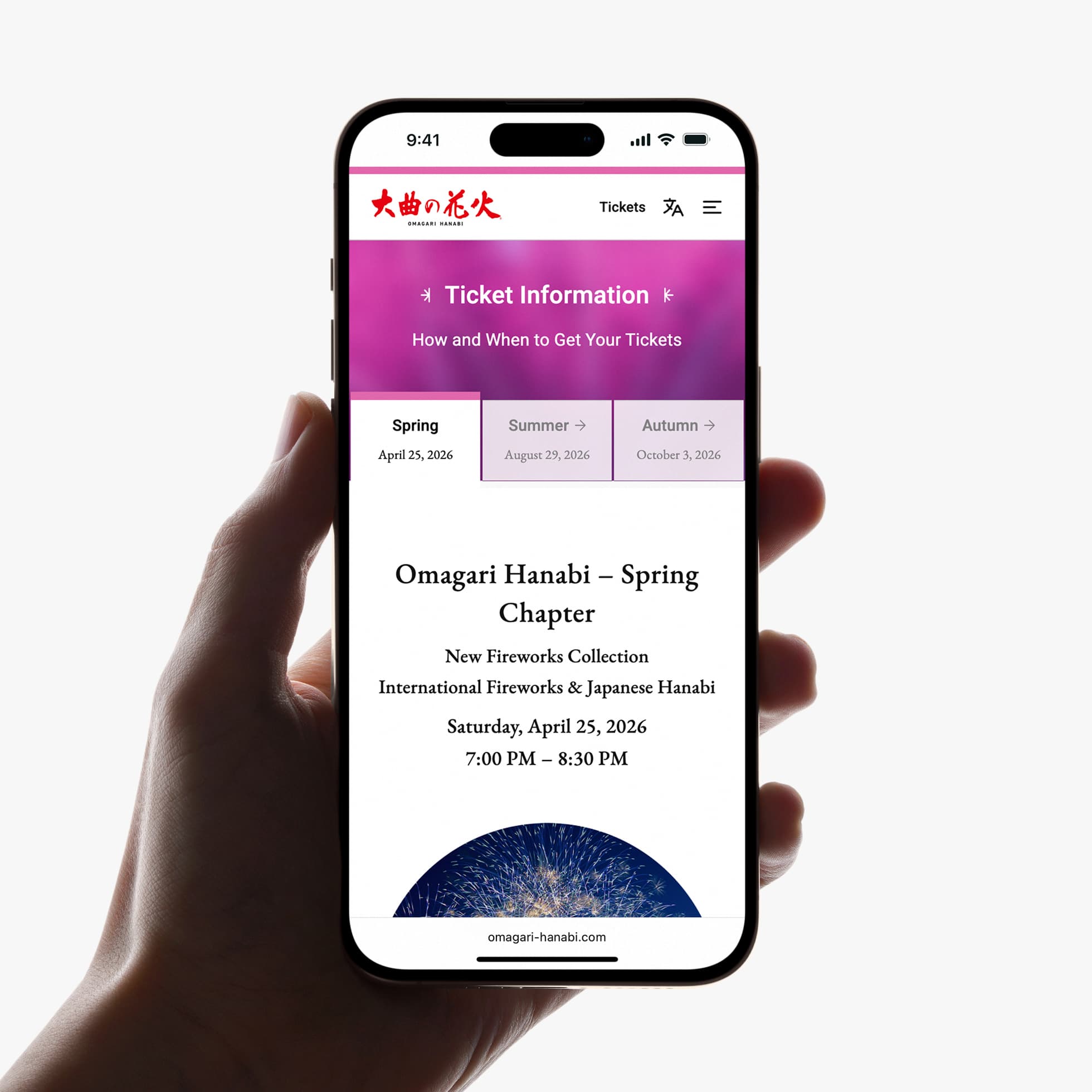
情報構造は来場者目線で再設計し、各大会の情報をはじめ、チケット、アクセス、FAQなどを直感的に把握できる構成へ整理。初めて訪れる方、高齢者、スマートフォン利用者、訪日観光客など、多様な利用者を想定しながら、ストレスなく目的へたどり着ける導線を設計しました。
また、CMSの導入により、段階的な情報公開や更新頻度の高いコンテンツにも柔軟に対応できる運用体制を構築。公式サイトとしての信頼性と継続的な情報発信を支える基盤を整えました。
公開後はクライアント側で自走運用を継続し、多言語・複数大会を含む複雑な情報設計も大きな問題なく運用されています。それは、表面的なデザインではなく、構造そのものが機能していることの静かな証明でもあります。
Omagari Hanabi is not one event but three — spring, summer, and autumn — each with its own audience, its own information, its own face. The previous site treated the website as a finished object. The real problem was the opposite: it had to keep working as the event kept changing.
So the first decision wasn’t about design. It was about where to anchor judgment. Rather than aiming for a single finished form, we built a structure that could be reshaped season after season and still hold together — one site, not three rebuilt every year.
The site routes visitors to the right place depending on which event they’re attending and what they need. We organized that complexity so that anyone — a first-time visitor, an older guest, an overseas traveler — could reach the information or the doorway they needed without getting lost. Bilingual support, mobile-first responsiveness, and a CMS the client could run themselves all followed from that single decision about structure.
Since launch, the client has managed the site independently, and a complex multilingual platform has run without issue — the quiet proof that the underlying judgment was sound.
目指したのは、魅力を伝えるだけではなく、来場者が必要な情報に迷わずたどり着き、安心して大会へ参加できる情報体験をつくることでした。
情報構造は来場者目線で再設計し、各大会の情報をはじめ、チケット、アクセス、FAQなどを直感的に把握できる構成へ整理。初めて訪れる方、高齢者、スマートフォン利用者、訪日観光客など、多様な利用者を想定しながら、ストレスなく目的へたどり着ける導線を設計しました。
また、CMSの導入により、段階的な情報公開や更新頻度の高いコンテンツにも柔軟に対応できる運用体制を構築。公式サイトとしての信頼性と継続的な情報発信を支える基盤を整えました。
公開後はクライアント側で自走運用を継続し、多言語・複数大会を含む複雑な情報設計も大きな問題なく運用されています。それは、表面的なデザインではなく、構造そのものが機能していることの静かな証明でもあります。
Omagari Hanabi is not one event but three — spring, summer, and autumn — each with its own audience, its own information, its own face. The previous site treated the website as a finished object. The real problem was the opposite: it had to keep working as the event kept changing.
So the first decision wasn’t about design. It was about where to anchor judgment. Rather than aiming for a single finished form, we built a structure that could be reshaped season after season and still hold together — one site, not three rebuilt every year.
The site routes visitors to the right place depending on which event they’re attending and what they need. We organized that complexity so that anyone — a first-time visitor, an older guest, an overseas traveler — could reach the information or the doorway they needed without getting lost. Bilingual support, mobile-first responsiveness, and a CMS the client could run themselves all followed from that single decision about structure.
Since launch, the client has managed the site independently, and a complex multilingual platform has run without issue — the quiet proof that the underlying judgment was sound.
Visit website — Japanese / English
「長持ちして、ちゃんと使われるWebサイト」の裏側
春・夏・秋と変化する情報構造をどのように整理し、設計したのか。 デザインの判断基準についてまとめた思考ノートです。
noteでプロセスの詳細を読む →
∵
Credits:
Producer: Plat’Home Co., Ltd.
Co-Producer: Hiroshi Okamura (5&UP)
Director / Designer: Hideki Owa (PULP)
Technical Director / Engineer: Kouhei Yamamoto (eggraphix)
Copywriter: Aki Mineta
Japanese-English Translators: David Willoughby & PULP
Client: Omagari Chamber of Commerce and Industry
December 2025
Previous / Home / Next
「らしさ」と「わかりやすさ」は、ちらかを削らずに両立できるか。
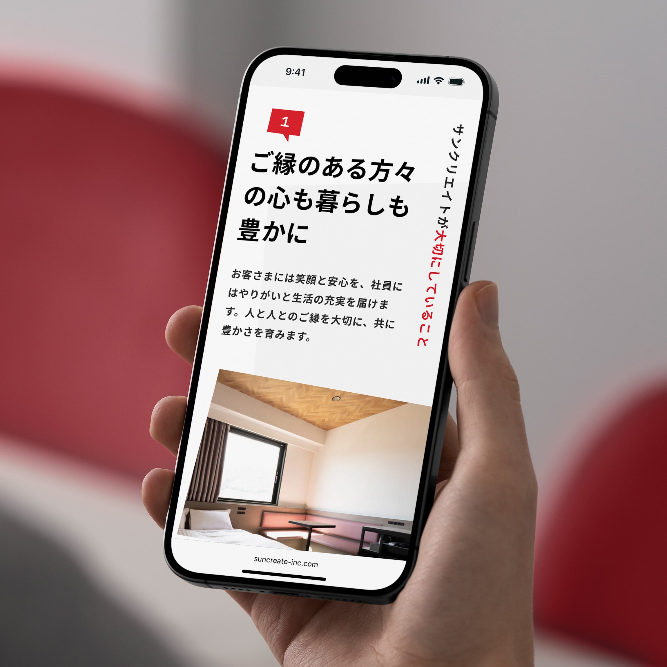
ホテル運営会社に求められる信頼性と、サンクリエイトらしい元気さ。このふたつは、ともすれば相反します。今回はその両立を、言葉で説明するのではなく、アートディレクションそのもので解くことを選びました。
社名やホテル名に含まれる「SUN」を軸に、色彩、タイポグラフィ、レイアウト、リズムといったデザイン言語を整理。できるだけシンプルな構造の中で、明るさと信頼感が自然に共存する状態を目指しています。
社名やホテル名に含まれる「SUN」を軸に、色彩、タイポグラフィ、レイアウト、リズムといったデザイン言語を整理。できるだけシンプルな構造の中で、明るさと信頼感が自然に共存する状態を目指しています。
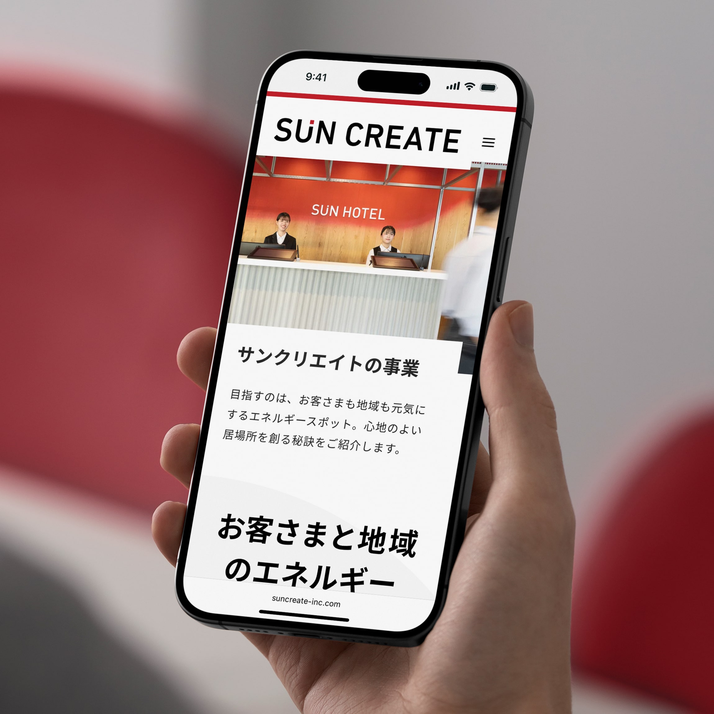
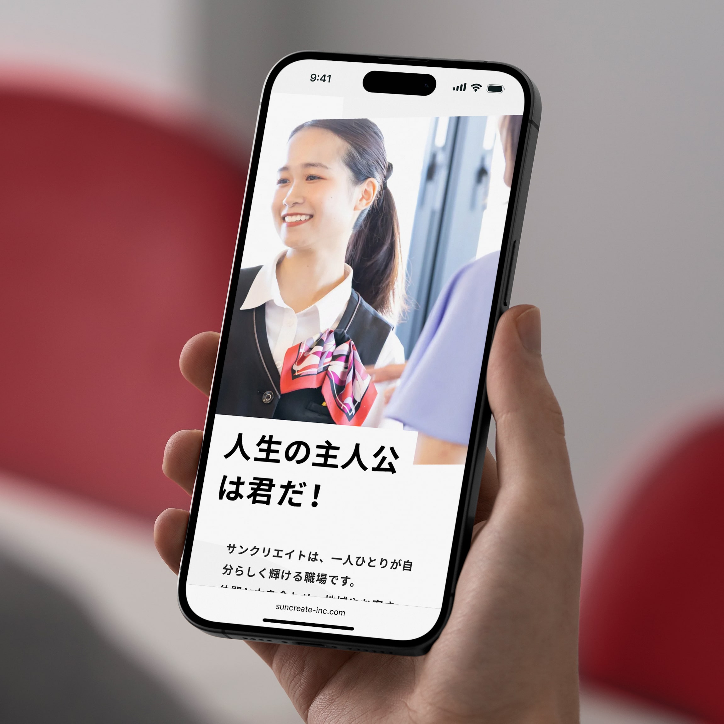
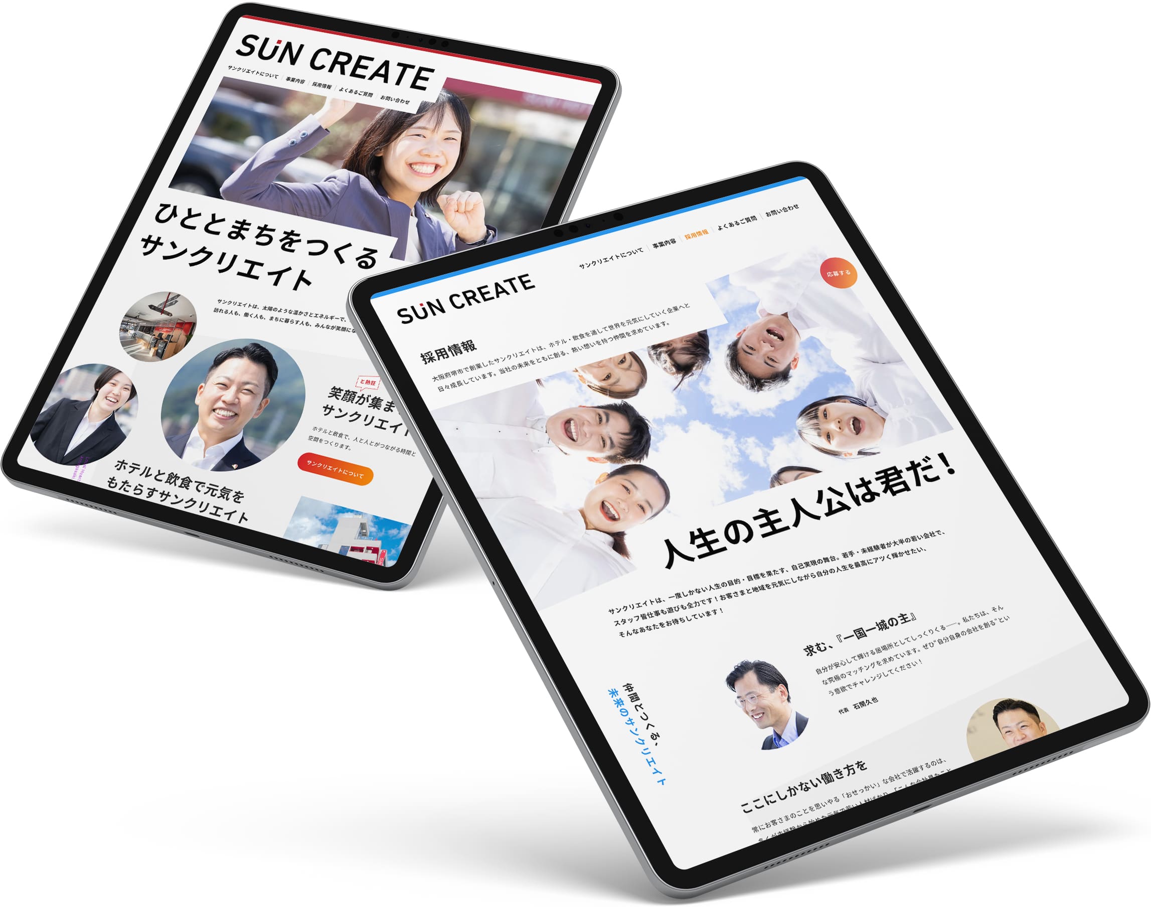
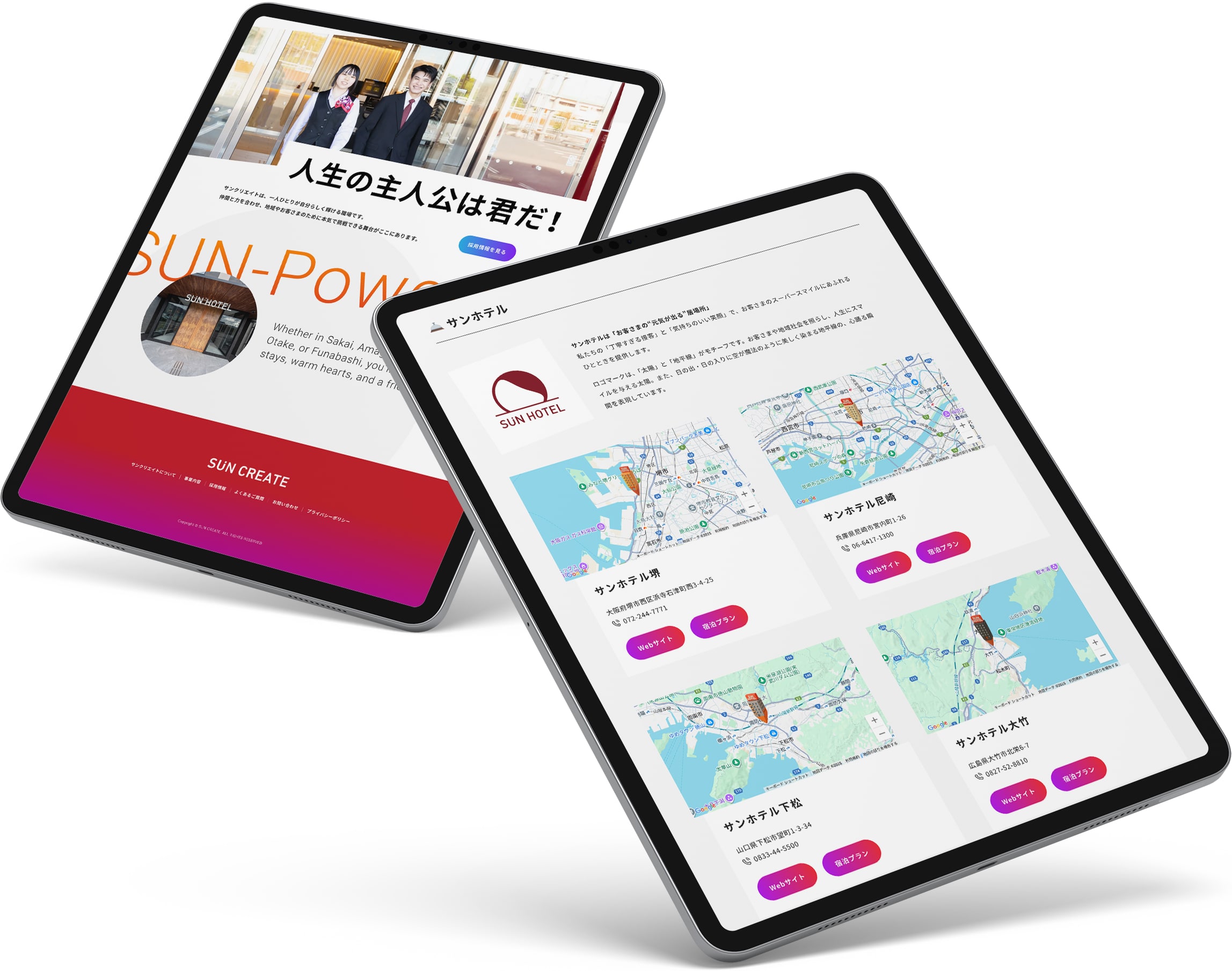
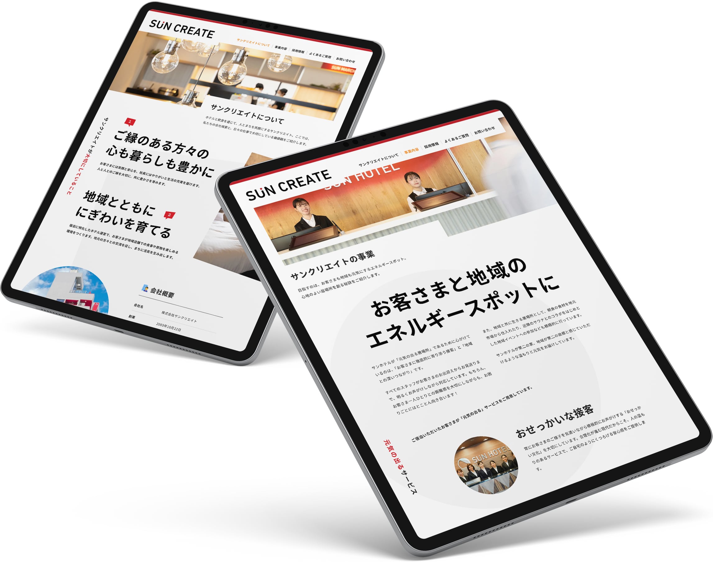
602様よりお声がけをいただき、ホテル運営会社・サンクリエイトのコーポレートWebサイトを制作しました。
サイト全体では、視覚的な勢いや軽快さを持たせながらも、情報構造自体はシンプルに整理。事業内容や企業情報へ迷わずアクセスできる構成としています。
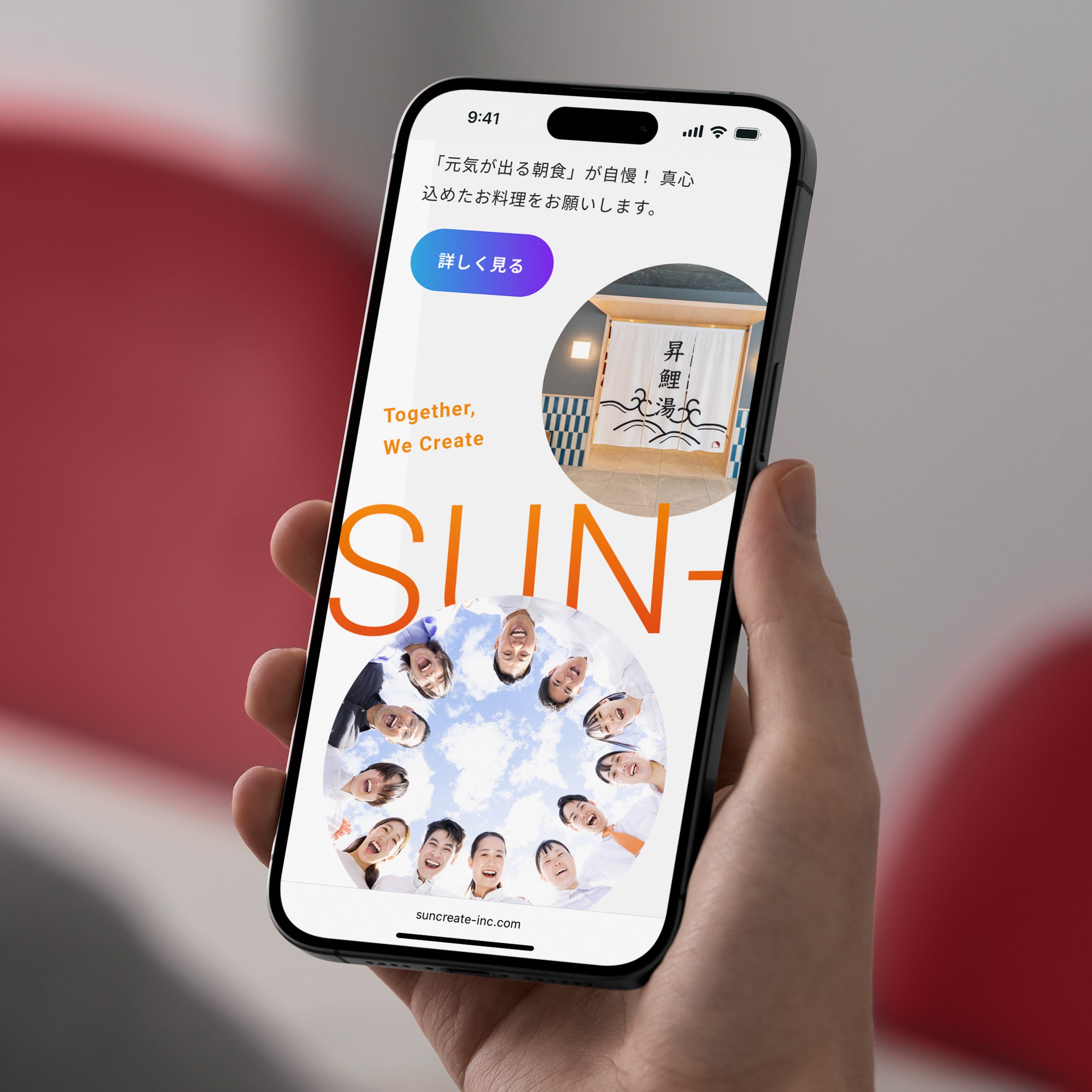
採用ページでは、全体のトーンとの連続性を保ちながら、少しだけ熱量を上げる方向へ調整。「ここで働きたい」と感じられる企業文化や空気感が、自然と伝わる設計を目指しました。
信頼感とエネルギー感。両立が難しいふたつの印象を、ひとつのデザイン言語としてまとめ上げることを試みたプロジェクトです。
サイト全体では、視覚的な勢いや軽快さを持たせながらも、情報構造自体はシンプルに整理。事業内容や企業情報へ迷わずアクセスできる構成としています。
採用ページでは、全体のトーンとの連続性を保ちながら、少しだけ熱量を上げる方向へ調整。「ここで働きたい」と感じられる企業文化や空気感が、自然と伝わる設計を目指しました。
信頼感とエネルギー感。両立が難しいふたつの印象を、ひとつのデザイン言語としてまとめ上げることを試みたプロジェクトです。
A hotel operator needs to look trustworthy. A company people want to join needs to look alive. Usually those two pull against each other — lean toward trust and it turns stiff; lean toward energy and it turns light. Sun Create needed both at once.
We chose to resolve that tension through art direction rather than explanation — not by writing “we are reliable and energetic,” but by making the design itself carry both. Built around the sun in the company’s name, color, typography, layout, and rhythm were tuned to read as bright and forward-moving the moment the page opens, while the information underneath stays simple and easy to navigate.
For recruiting, the palette turns from red to a cooler blue — the hotter flame, not the softer one. Energy rises, composure holds.
Two impressions that rarely sit together — trust and energy — hold in a single, coherent face.
Visit website — Japanese
Credits:
Producer: Kaoru Chono (602)
Project Managers: Kaoru Chono & Rieko Nakanishi (602)
Director / Designer: Hideki Owa (PULP)
Technical Director / Engineer: Kouhei Yamamoto (eggraphix)
Copywriters: Ikuko Noda & PULP
Photographer: Tomoaki Makino
Client: Sun Create
October 2025
Previous / Home / Next


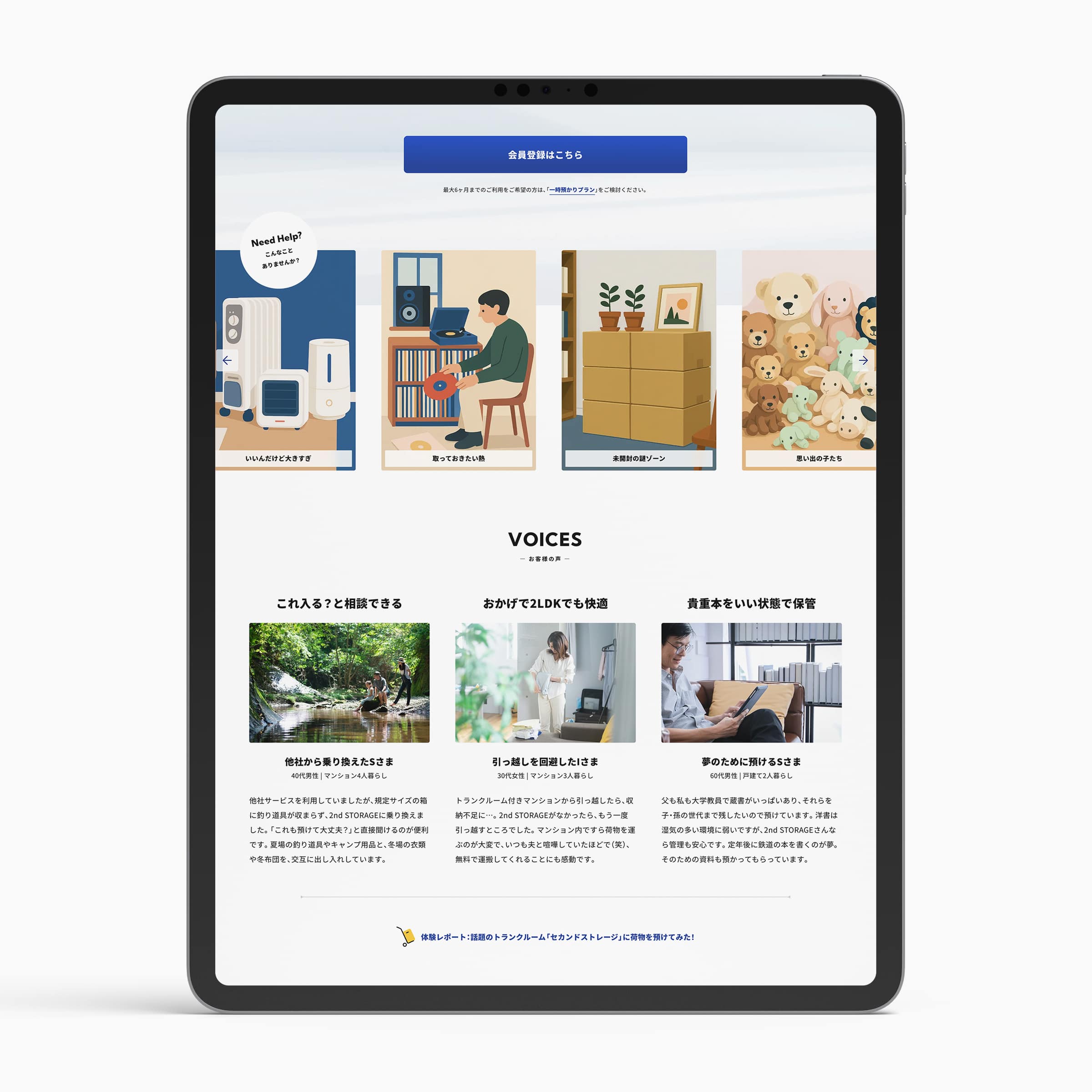
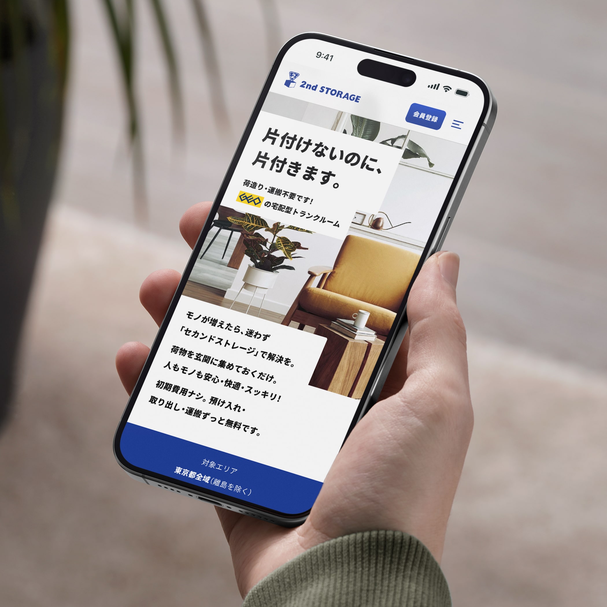
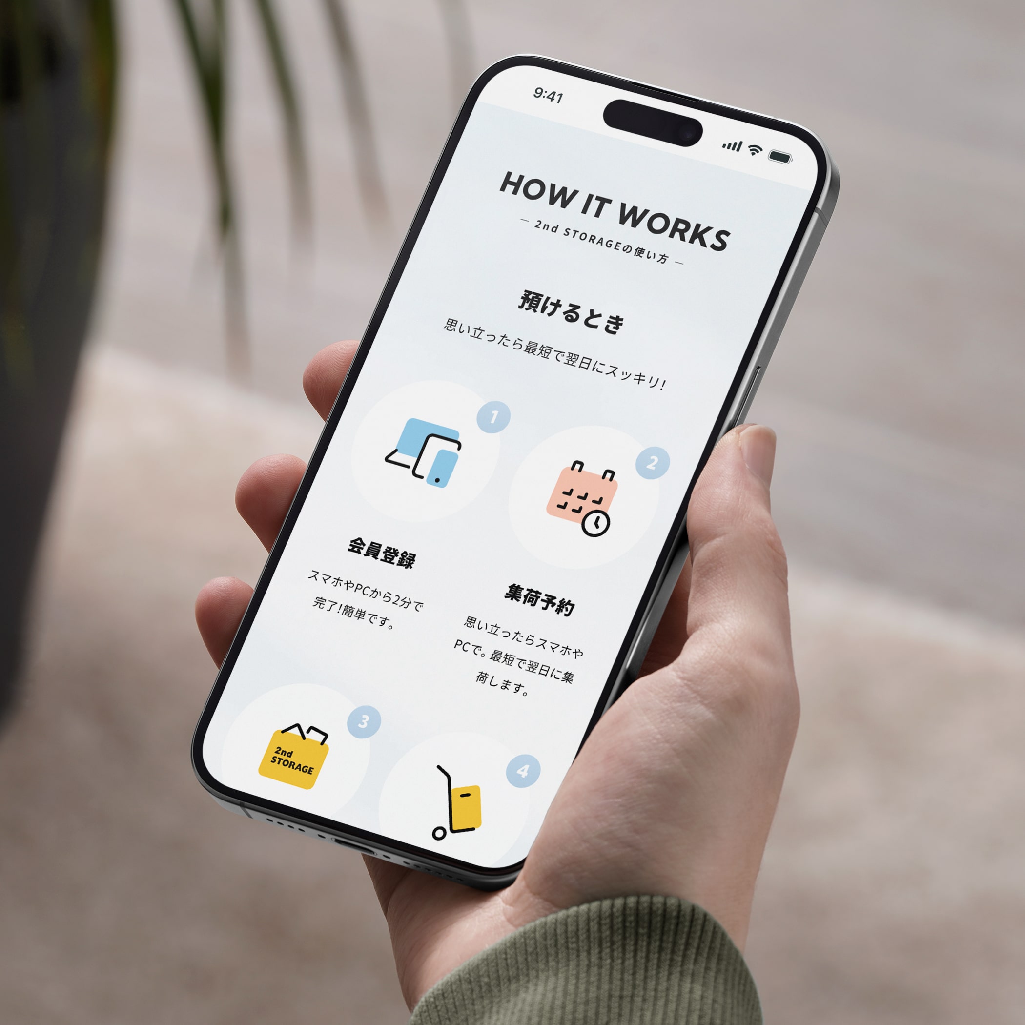
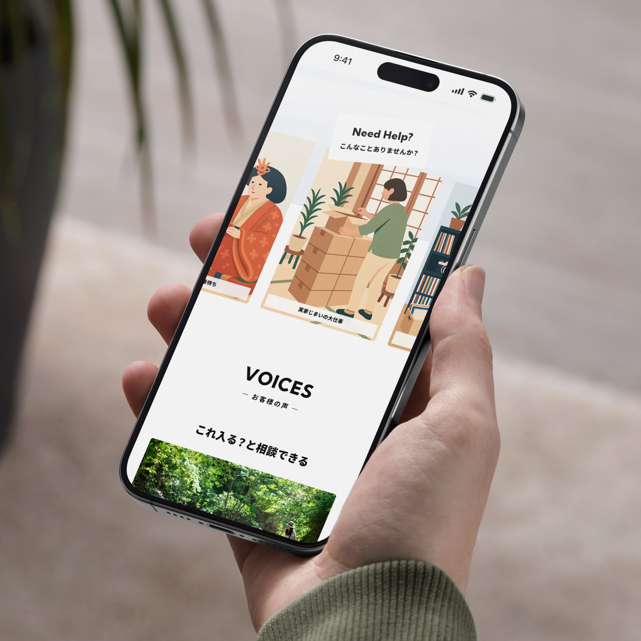
GEOグループが展開するトランクルームサービス「2nd STORAGE」のキャンペーンLPを制作しました。
2024年に公開したLPでは、ユーザーが共感しやすい情緒的価値を入口としながら、サービスの利便性や安心感といった機能的価値、さらにキャンペーン特典へと段階的につなげる構成によって、利用検討時のニーズや不安に応える体験を設計しました。
2025年版では、価格・料金プラン・他社比較など、検討段階で重視される情報をより明確に整理。加えて、2nd STORAGEならではの特長や安全性、柔軟な契約プラン、ご利用方法、お客様の声、活用事例などのコンテンツを拡充し、サービス理解を深めやすい構成へとアップデートしています。
また、機能面の訴求だけに偏るのではなく、「安心して利用できそう」「自分の暮らしに合っていそう」と感じられる心理的な納得感も重視。情緒的価値と機能的価値のバランスを取りながら、比較検討から行動へと自然につながる導線設計を行いました。
今回のアップデートを通じて、より幅広いユーザーに2nd STORAGEの価値を届けるとともに、サービス理解と利用促進につながるLPを目指しました。
We designed a new campaign landing page for 2nd Storage, GEO Group’s self-storage service. Building on the 2024 launch, which led with emotional resonance before introducing functional benefits, the 2025 version shifts its focus toward clearer, more practical decision-making. Pricing, plan comparisons, key features, safety, and flexibility are presented alongside expanded content such as usage guides, customer voices, and real-world use cases.
Rather than prioritizing functionality alone, the new LP balances rational clarity with emotional reassurance — helping users feel both confident and comfortable choosing the service. The result is a page designed to support consideration, comparison, and action in a natural flow.
Through this update, we aimed to reach a wider audience while improving service understanding and conversion.
Visit website — Japanese
Credits:
Producer: Miki Fukuda (Hito-Kurashi Lab)
Project Managers: Kaoru Chono & Rieko Nakanishi (602)
Director / Designer: Hideki Owa (PULP)
Technical Director / Engineer: Kouhei Yamamoto (eggraphix)
Copywriter: Aki Mineta
Client: 2nd STORAGE (GEO Holdings Corporation)
July 2025
Previous / Home / Next
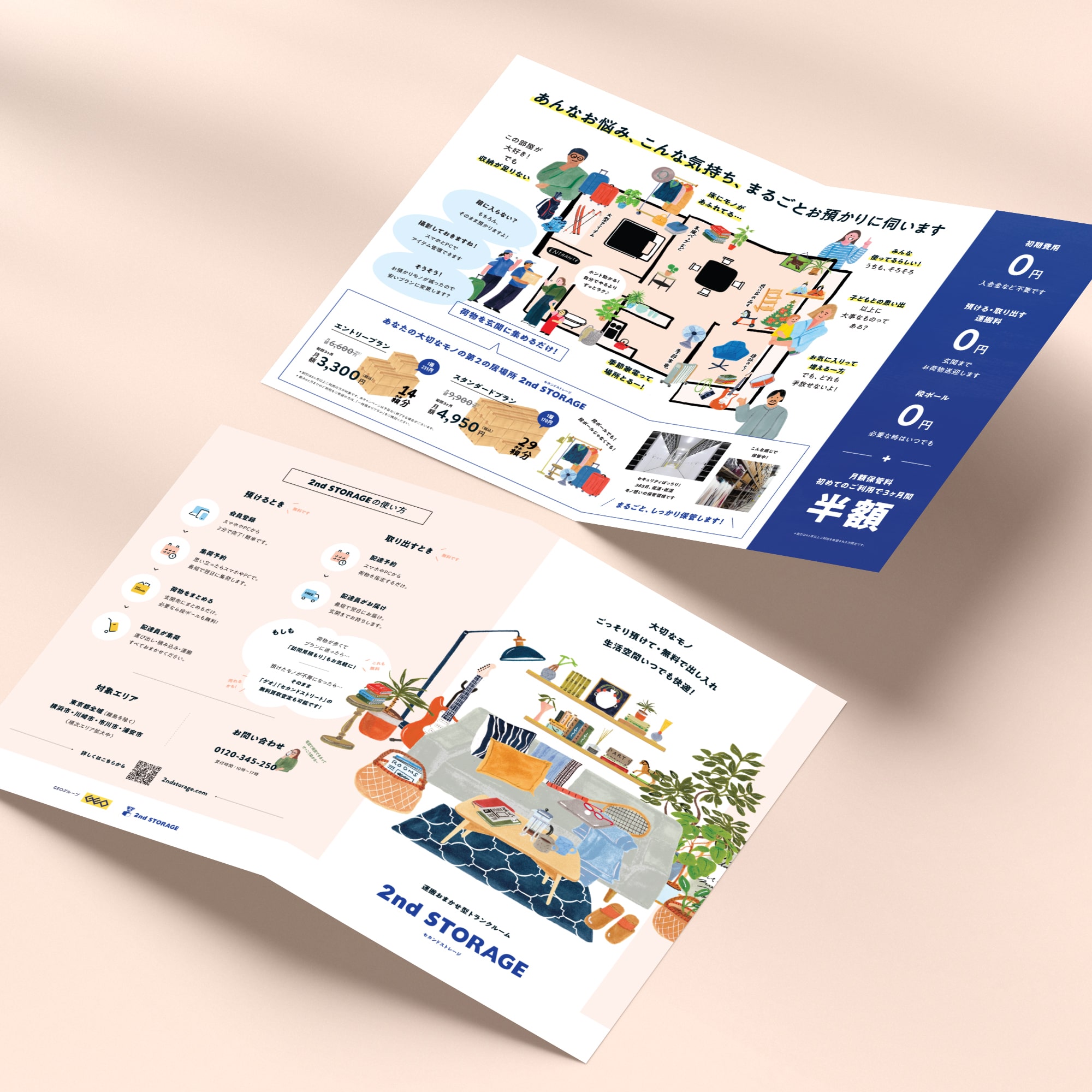
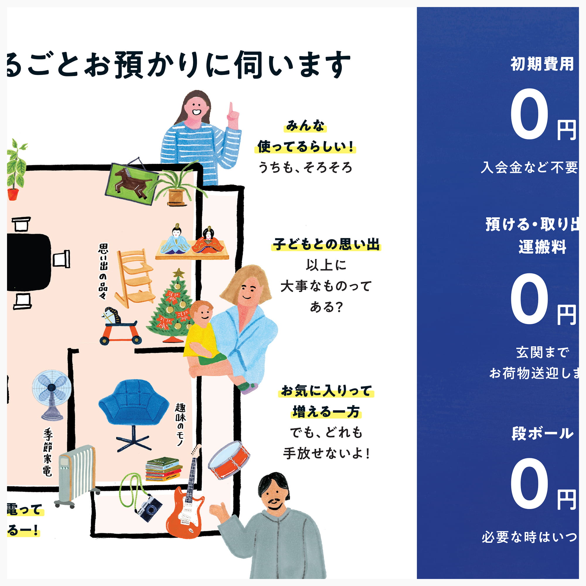
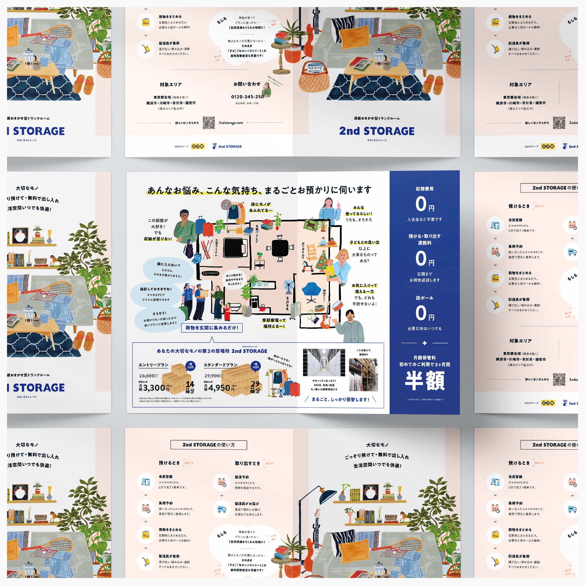
伝えたいことが多すぎる。そのとき、何を削れば、いちばん伝わるのか。
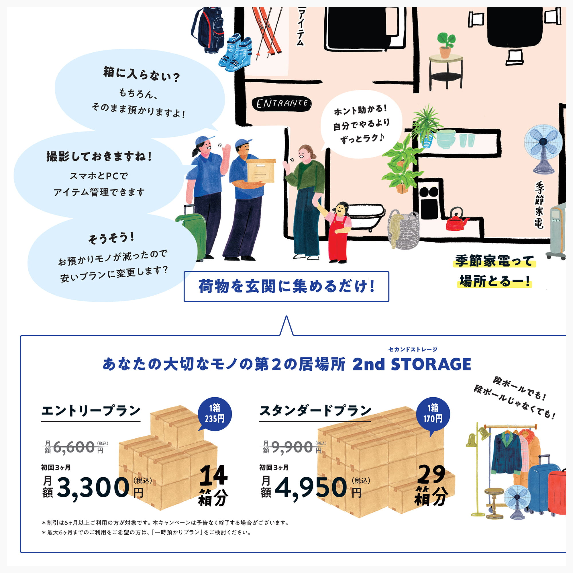
リニューアルの出発点は、「伝えたいことが多すぎて散漫になっている」という課題でした。そこで、一枚のリーフレットを「なぜ使うのか」「何ができるのか」「どう始めるのか」という三つの役割に整理。それぞれの面に、ひとつの目的だけを持たせています。
すべてを均等に説明するのではなく、読む順序そのものを設計する。最初の面では、あえて機能を語らず、「自分の暮らしに関係ありそうだ」と感じてもらうことを優先しました。
すべてを均等に説明するのではなく、読む順序そのものを設計する。最初の面では、あえて機能を語らず、「自分の暮らしに関係ありそうだ」と感じてもらうことを優先しました。
2024年度のキャンペーンWebサイトと連動し、イベント会場や各種タッチポイントで配布するリーフレットを制作しました。
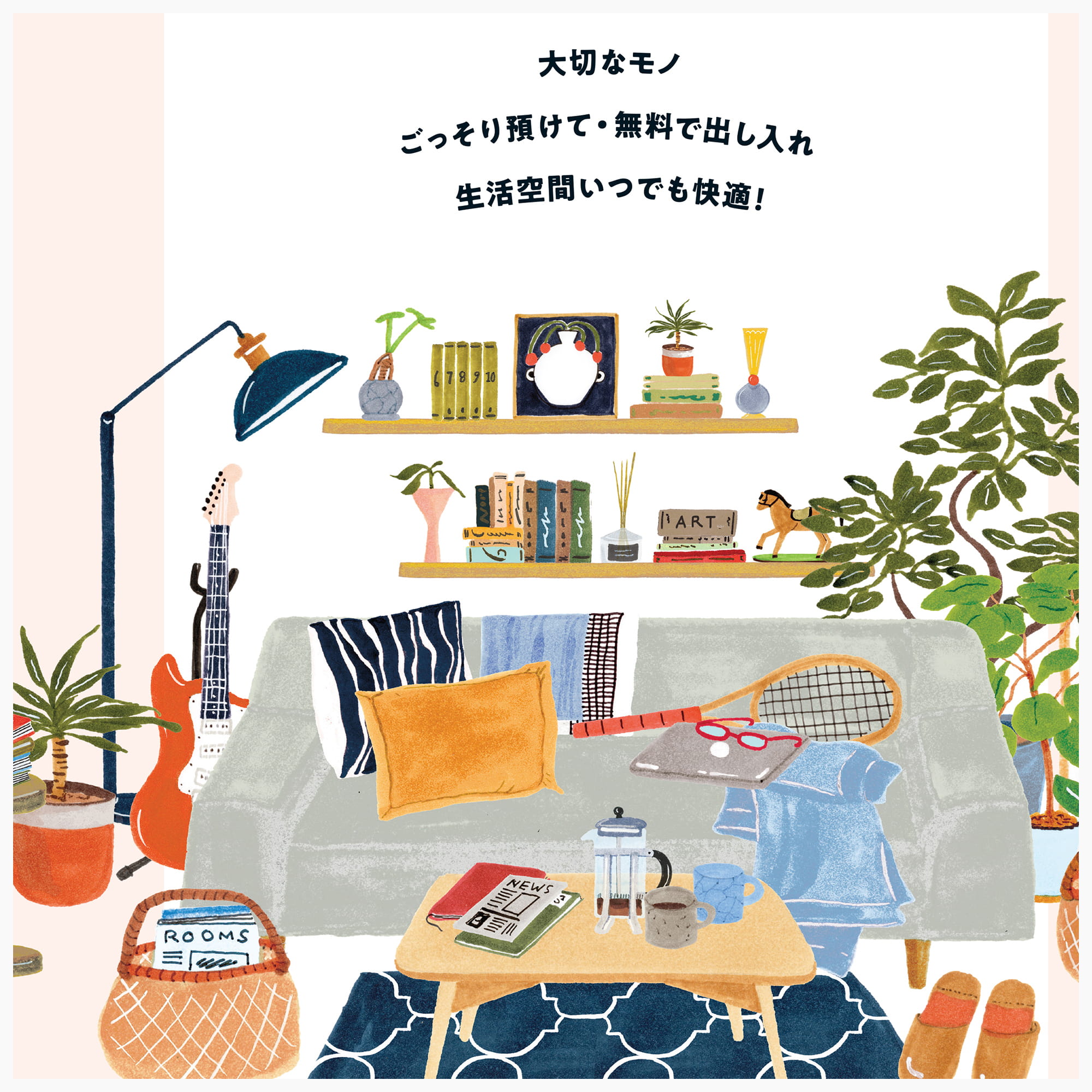
イラストは、収納を特別な行為としてではなく、暮らしの延長として自然に想像できる距離感を意識。情報設計も要点を絞り込み、初めての方でも無理なく理解できる構成としています。
Webと紙、それぞれの役割を整理しながら、一貫したブランド体験を設計したプロジェクトです。
The problem wasn’t too little to say. It was too much. The earlier material tried to tell everyone everything, and as a result, few people opened it at all.
So we gave the single sheet a single job per side. The front carries only the reason to pick it up — the emotional pull, nothing functional. The inside holds the substance: features, safety, pricing. The back closes with how to start and where to ask. Rather than weighting everything equally, we designed the order in which a reader meets it — and deliberately said nothing about function on the first face they see.
Connected to the 2024 campaign site, the leaflet carries the same world onto paper, using illustration that settles into everyday life so that a first-time reader can picture the service as their own.
Credits:
Producer: Miki Fukuda (Hito-Kurashi Lab)
Project Managers: Kaoru Chono & Rieko Nakanishi (602)
Director / Designer: Hideki Owa (PULP)
Copywriter: Aki Mineta
Illustrator: Grace Lee
Client: 2nd STORAGE (GEO Holdings Corporation)
November 2024
Previous / Home / Next