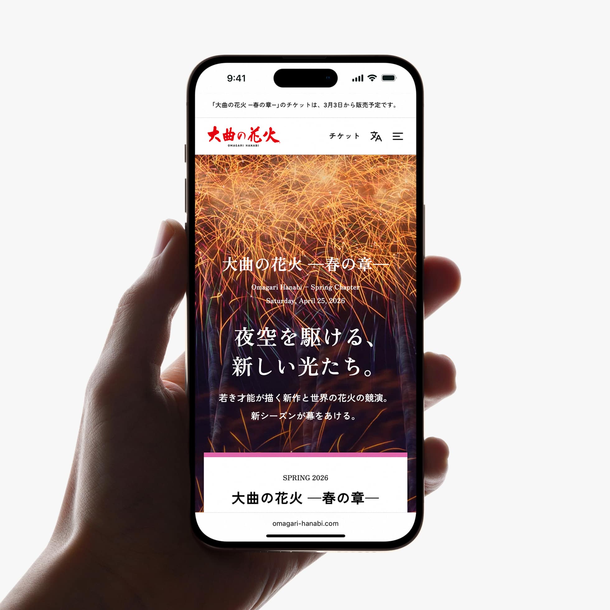
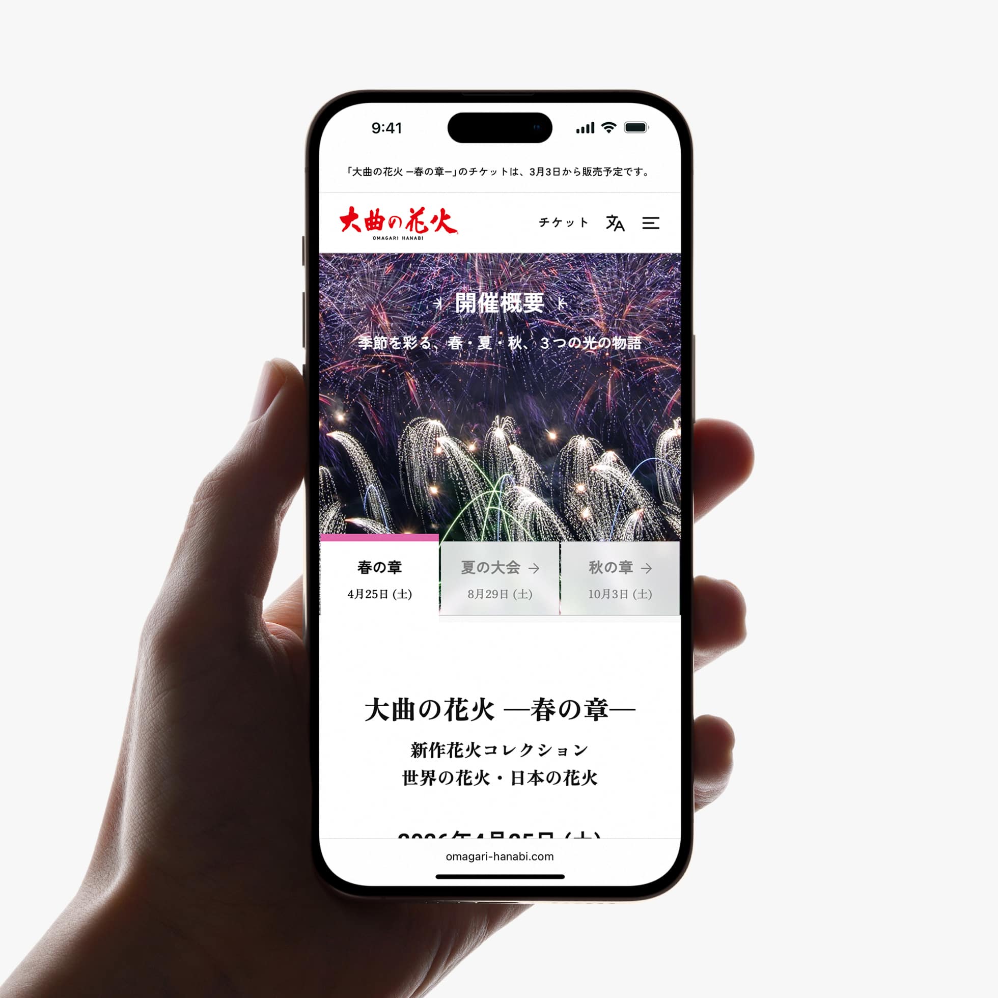
「大曲の花火」は、秋田県大仙市大曲で春・夏・秋に開催される、3つの花火大会の総称です。
PULPは公式Webサイトのリニューアルにあたり、企画、コンテンツ開発、UX・UIデザイン、実装までを一貫してディレクションしました。
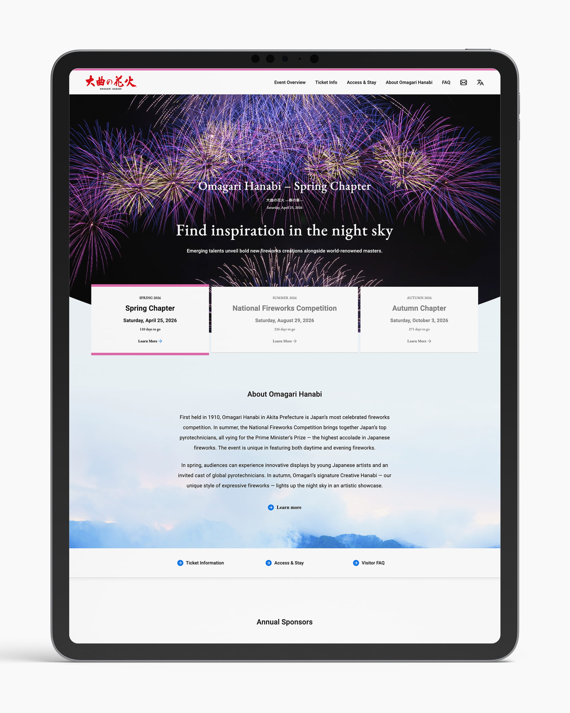
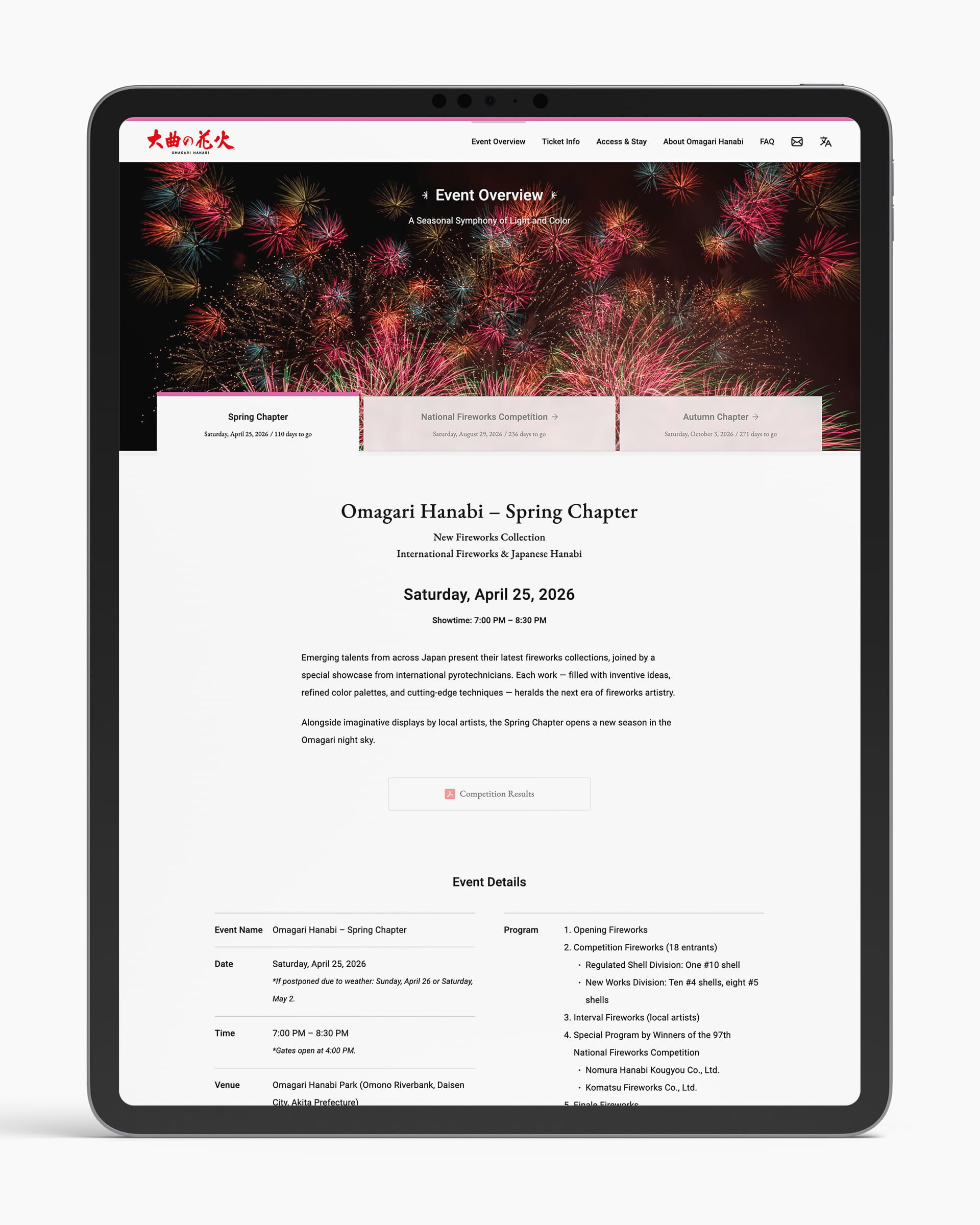
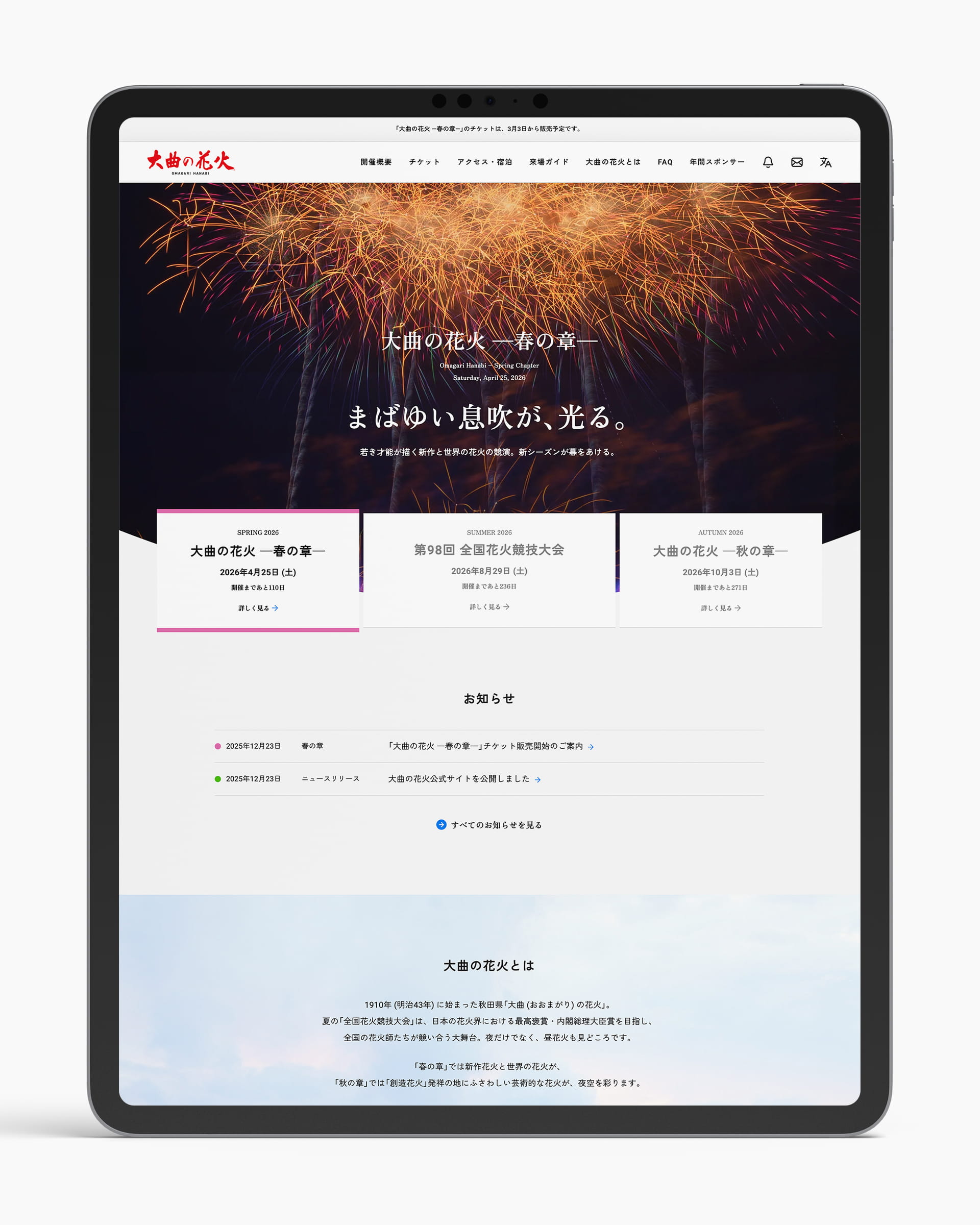
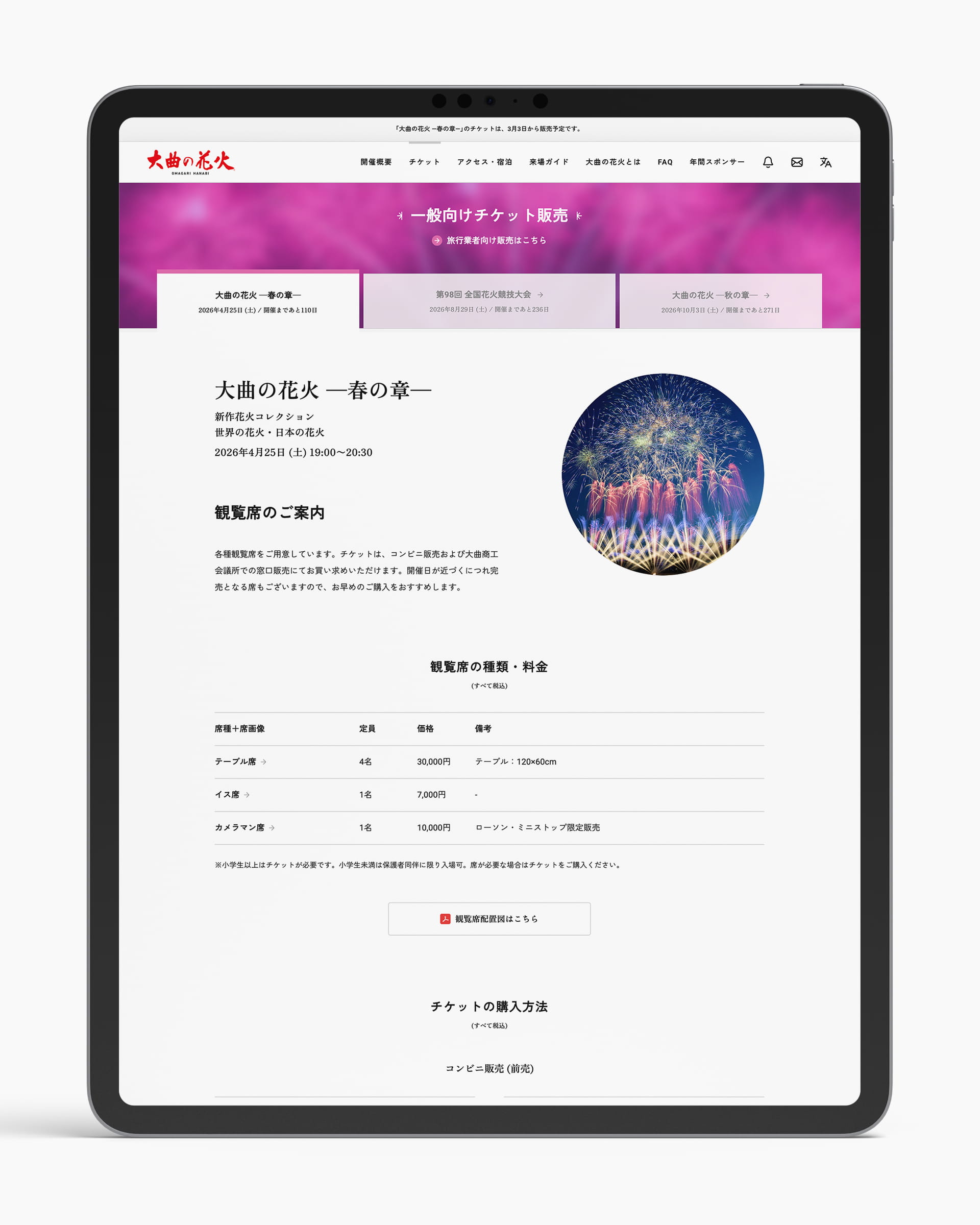
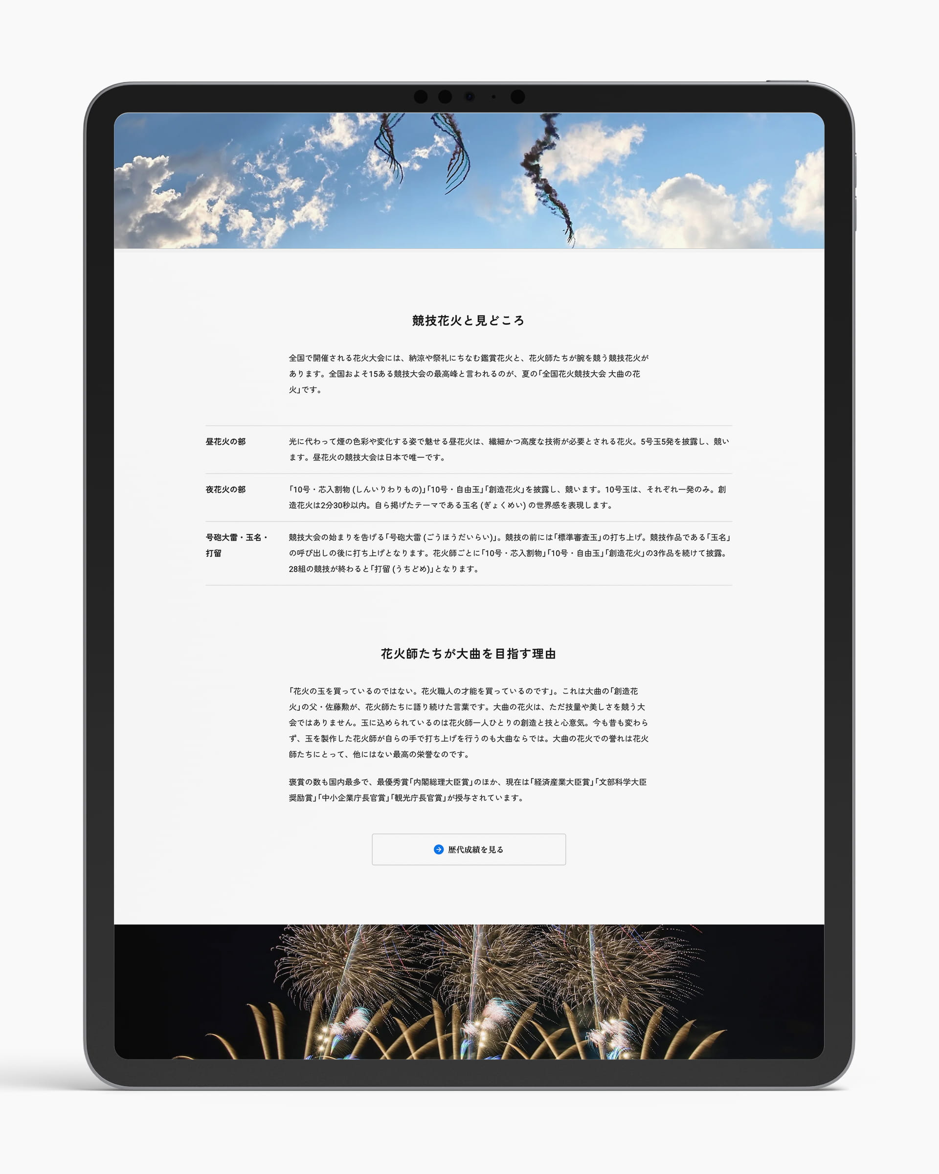
本プロジェクトでは、「大曲の花火」の魅力や価値を正しく、効果的に発信しながら、来場者が必要な情報に迷わずたどり着き、安心して大会に参加できる情報体験の再構築を行いました。日本語・英語に対応した多言語設計と、モバイルファーストを前提としたレスポンシブデザインを採用しています。
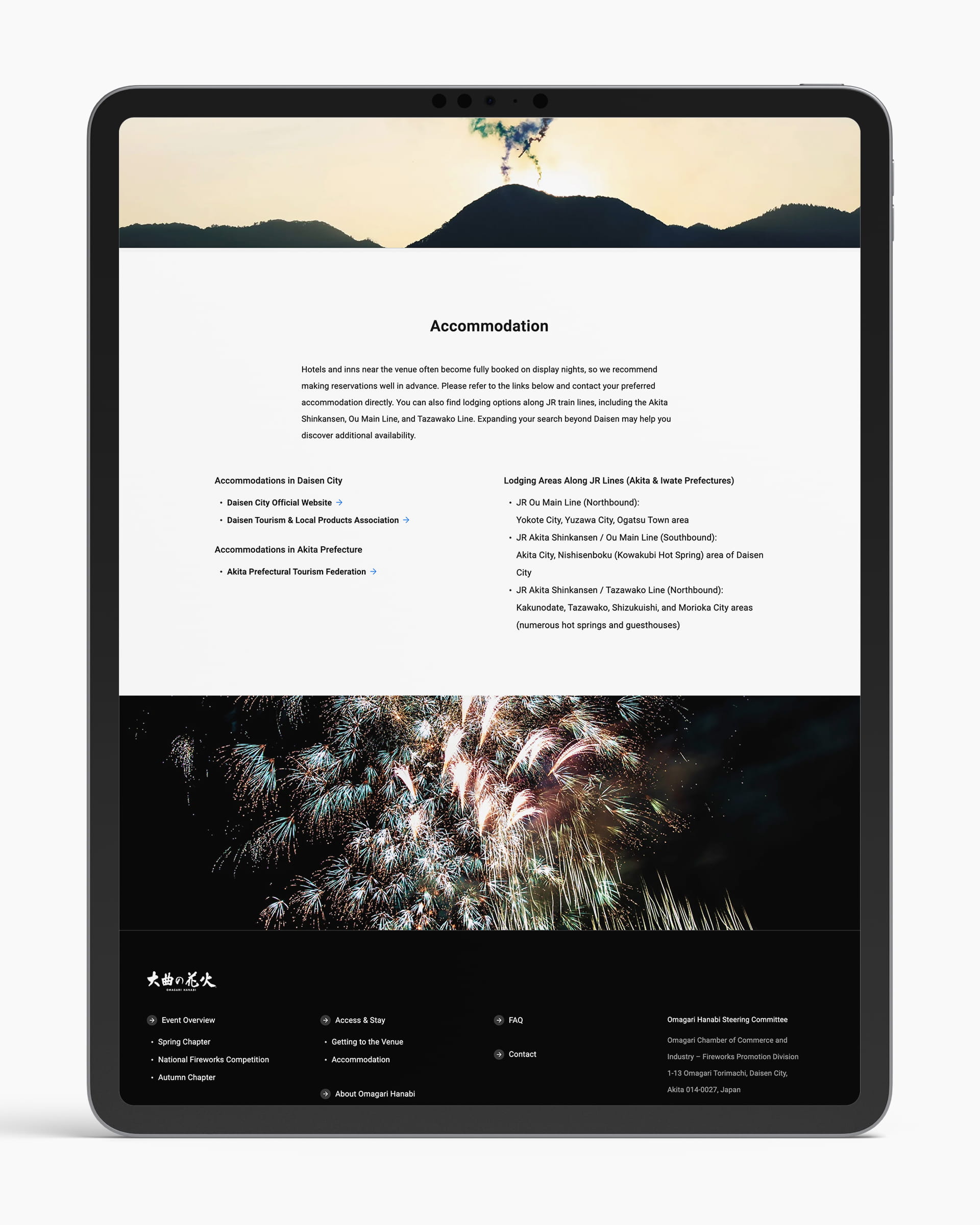
情報構造は来場者目線で整理し、春・夏・秋それぞれの大会情報をはじめ、チケット案内、アクセス、FAQなどを直感的に把握できる構成へと再設計しました。初めて訪れる方やスマートフォン利用者、高齢者、訪日観光客にとっても使いやすく、ストレスの少ないユーザー体験を目指しています。
また、コンテンツ管理システム(CMS)を導入することで、段階的な情報公開にも対応できる柔軟性を確保。大会概要やチケット情報など、更新頻度の高いコンテンツを現場でスムーズに管理・更新できる運用体制を整備しました。公式サイトとしての信頼性と、継続的な情報発信力の向上にも貢献しています。
来場者体験の向上とブランド価値の強化を両立させ、「大曲の花火」の情報基盤となる公式Webサイトを目指したプロジェクトです。
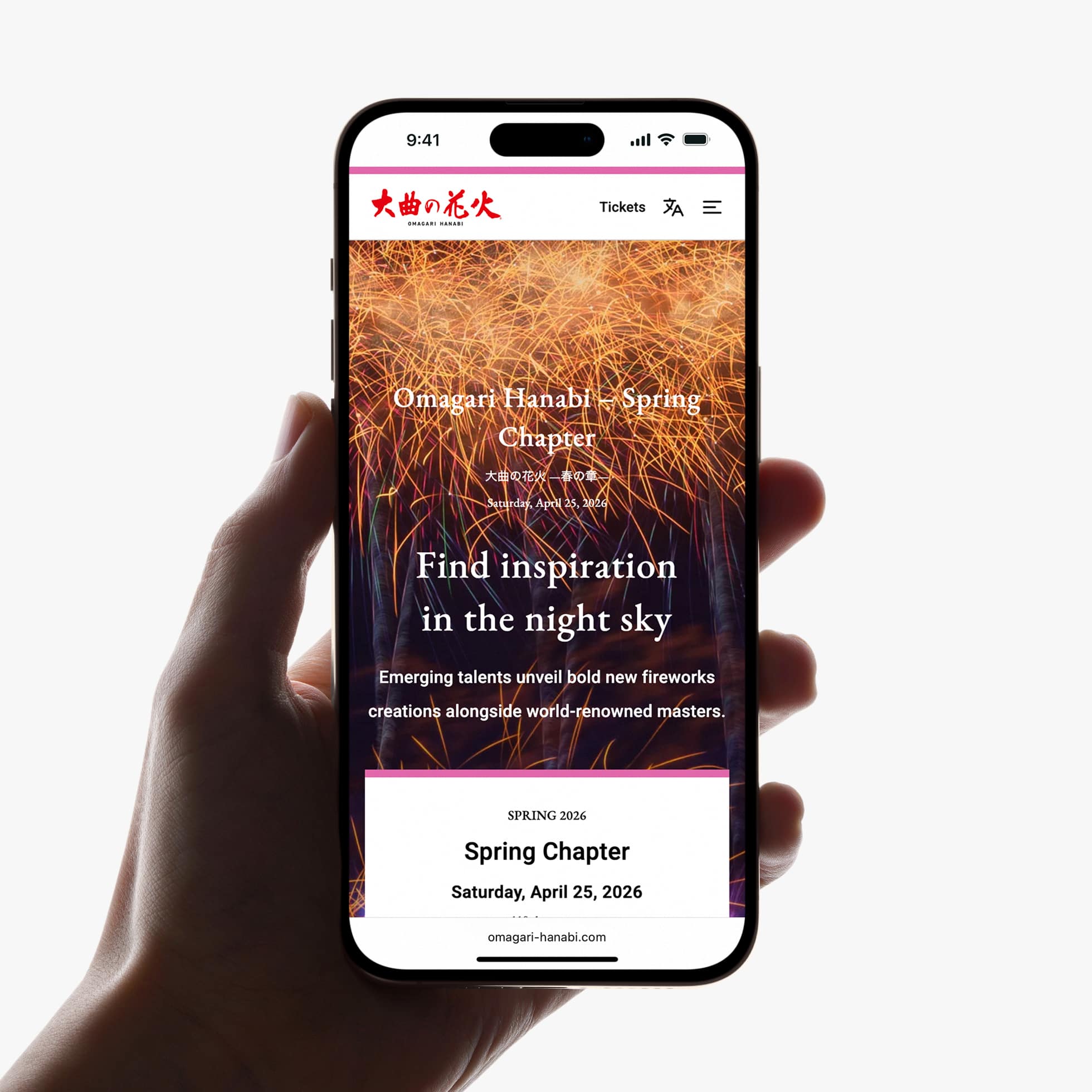
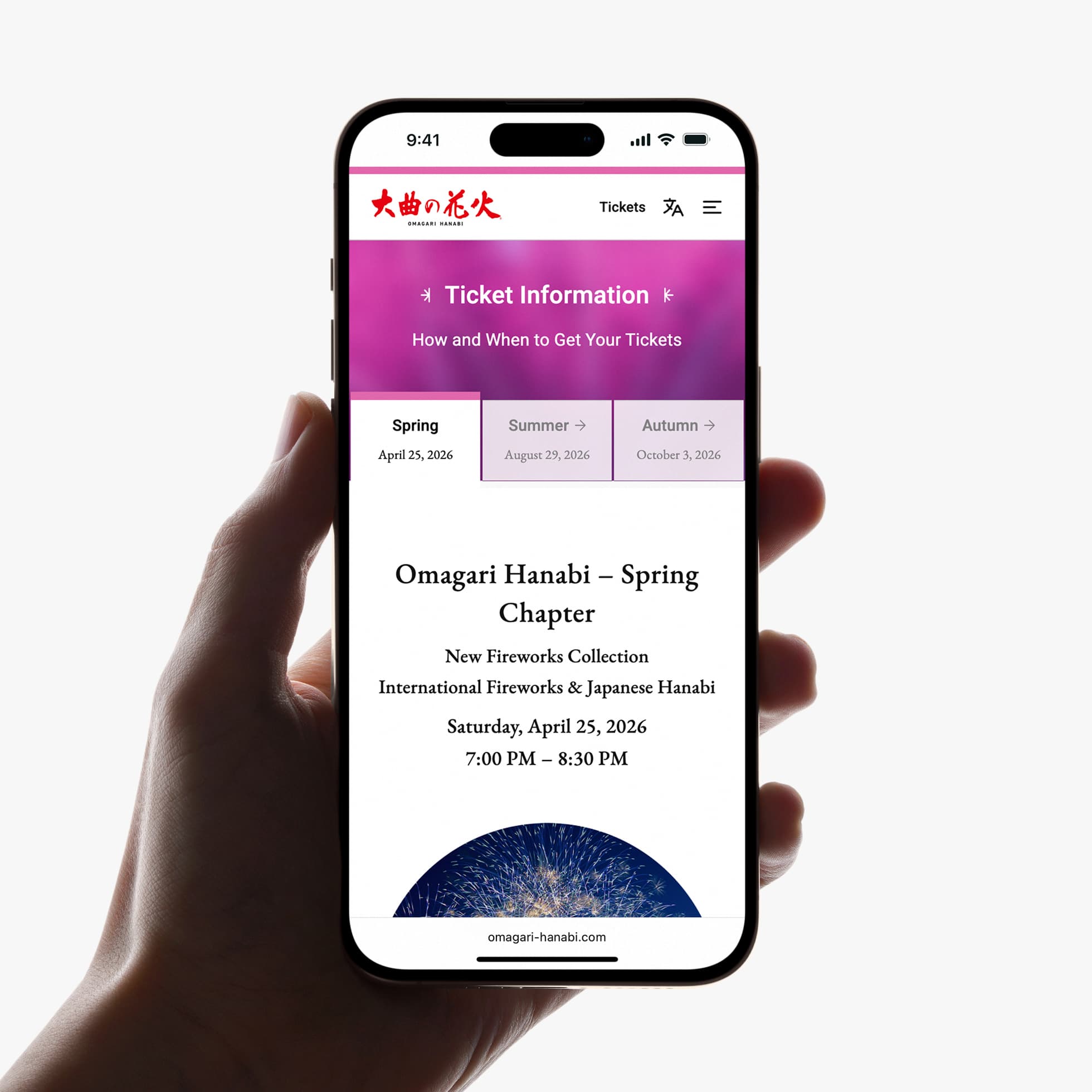
Omagari Hanabi is a collective name for three seasonal fireworks festivals held in Omagari, Akita.
PULP directed the renewal of the official website from concept to launch, overseeing content planning, UX/UI design, and development.
Designed with a mobile-first, bilingual structure, the site reorganizes complex event information into a clear and accessible experience for both domestic and international audiences. With a global perspective on digital communication, the platform supports long-term operation while helping convey the cultural value of Omagari Hanabi beyond Japan.
PULPは公式Webサイトのリニューアルにあたり、企画、コンテンツ開発、UX・UIデザイン、実装までを一貫してディレクションしました。
本プロジェクトでは、「大曲の花火」の魅力や価値を正しく、効果的に発信しながら、来場者が必要な情報に迷わずたどり着き、安心して大会に参加できる情報体験の再構築を行いました。日本語・英語に対応した多言語設計と、モバイルファーストを前提としたレスポンシブデザインを採用しています。
情報構造は来場者目線で整理し、春・夏・秋それぞれの大会情報をはじめ、チケット案内、アクセス、FAQなどを直感的に把握できる構成へと再設計しました。初めて訪れる方やスマートフォン利用者、高齢者、訪日観光客にとっても使いやすく、ストレスの少ないユーザー体験を目指しています。
また、コンテンツ管理システム(CMS)を導入することで、段階的な情報公開にも対応できる柔軟性を確保。大会概要やチケット情報など、更新頻度の高いコンテンツを現場でスムーズに管理・更新できる運用体制を整備しました。公式サイトとしての信頼性と、継続的な情報発信力の向上にも貢献しています。
来場者体験の向上とブランド価値の強化を両立させ、「大曲の花火」の情報基盤となる公式Webサイトを目指したプロジェクトです。
Omagari Hanabi is a collective name for three seasonal fireworks festivals held in Omagari, Akita.
PULP directed the renewal of the official website from concept to launch, overseeing content planning, UX/UI design, and development.
Designed with a mobile-first, bilingual structure, the site reorganizes complex event information into a clear and accessible experience for both domestic and international audiences. With a global perspective on digital communication, the platform supports long-term operation while helping convey the cultural value of Omagari Hanabi beyond Japan.
Visit website — Japanese / English
Credits:
Producer: Plat'Home Co., Ltd.
Co-Producer: Hiroshi Okamura (5&UP)
Director / Designer: Hideki Owa (PULP)
Technical Director / Engineer: Kouhei Yamamoto (eggraphix)
Copywriter: Aki Mineta
Japanese-English Translators: David Willoughby & PULP
Client: Omagari Chamber of Commerce and Industry
December 2025

株式会社PULPは、東京を拠点に活動するデザインスタジオです。
企業や組織の“らしさ”を丁寧に観察し、言葉と構造、そしてビジュアルに置き換えることで、長く機能し続けるデザインをつくっています。
ブランドコミュニケーション、Webサイト、デジタル体験など、領域を横断しながら、精度と誠実さをもって本質的なデザインを追求しています。
デザインとは、何かを飾ることではなく、「どうありたいか」を明確にするためのプロセスだと考えています。
PULP is a Tokyo-based design studio working across brand communication, web, and digital experience design. We translate ideas into clear language, structure, and form — creating design that lasts through precision and empathy.
Our work is built on observation, honesty, and thoughtful simplicity. For us, design is less about decoration, and more about defining what something truly means to be.
Read more
∵
Download the PDF booklet
∵
1. Philosophy
長く機能し、信頼を育てるデザインをつくります。
We create design that lasts — building trust that grows over time.
2. Process
観察・構造・言葉を軸に、本質を見極めるプロセスを大切にしています。
Our process is grounded in observation, structure, and language — a way to uncover what truly matters.
3. Collaboration
クライアントやパートナーとともに、目的を共有しながら形にしていきます。
We work collaboratively, shaping ideas through shared purpose and dialogue.
4. Cost / Timeline / Support
内容に応じて最適な方法をご提案し、完成後も継続的に支援します。
Each project is tailored with care — from scope and schedule to ongoing support.
5. Careers / Partnerships
プロジェクトに共感し、ともに考え、つくる仲間を歓迎します。
We welcome collaborators who share our values and curiosity for making things meaningful.
お問い合わせや案件のご依頼・ご相談は info@pulp.jp まで、まずはメールでお気軽にご連絡ください。
For further information, please get in touch with us at info@pulp.jp.
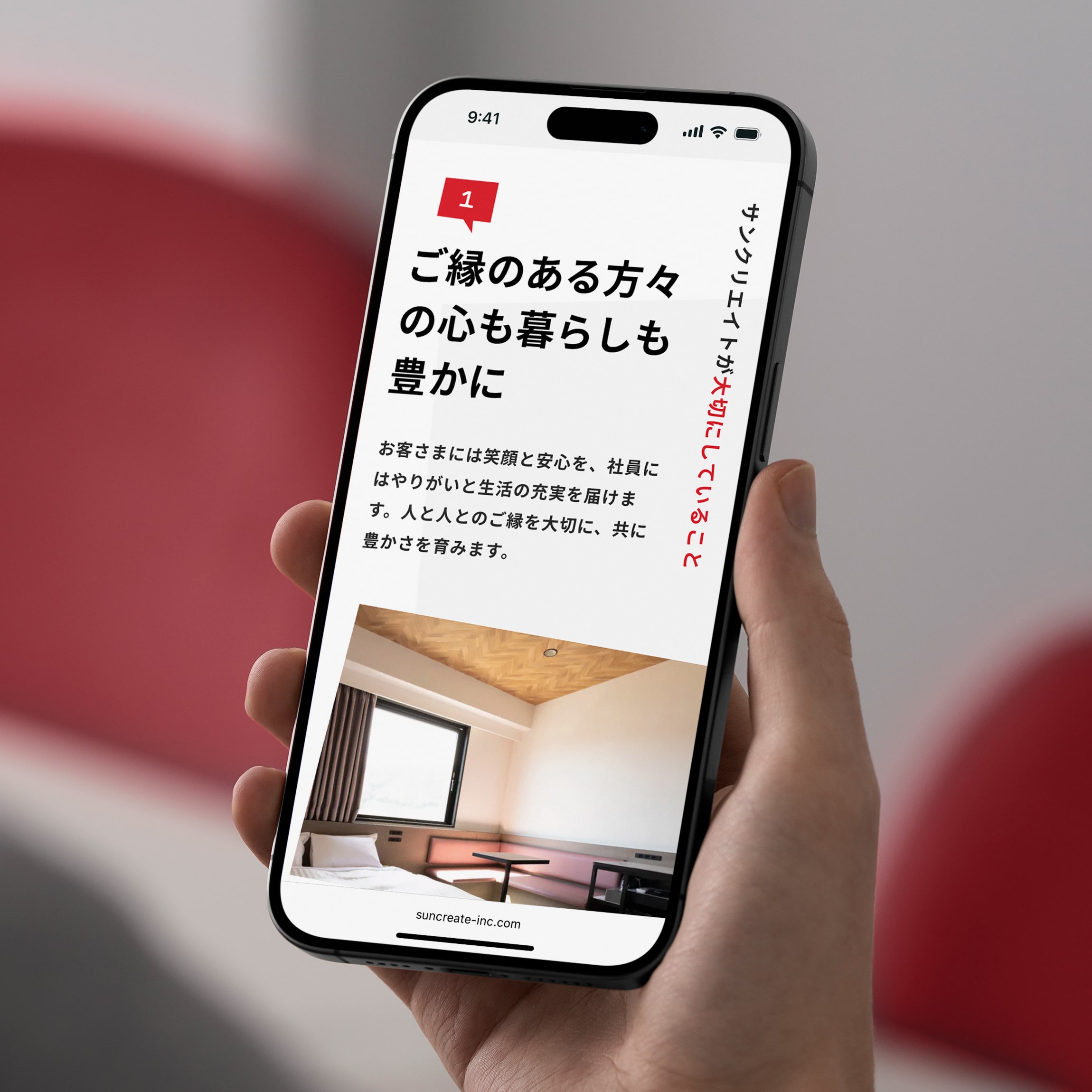
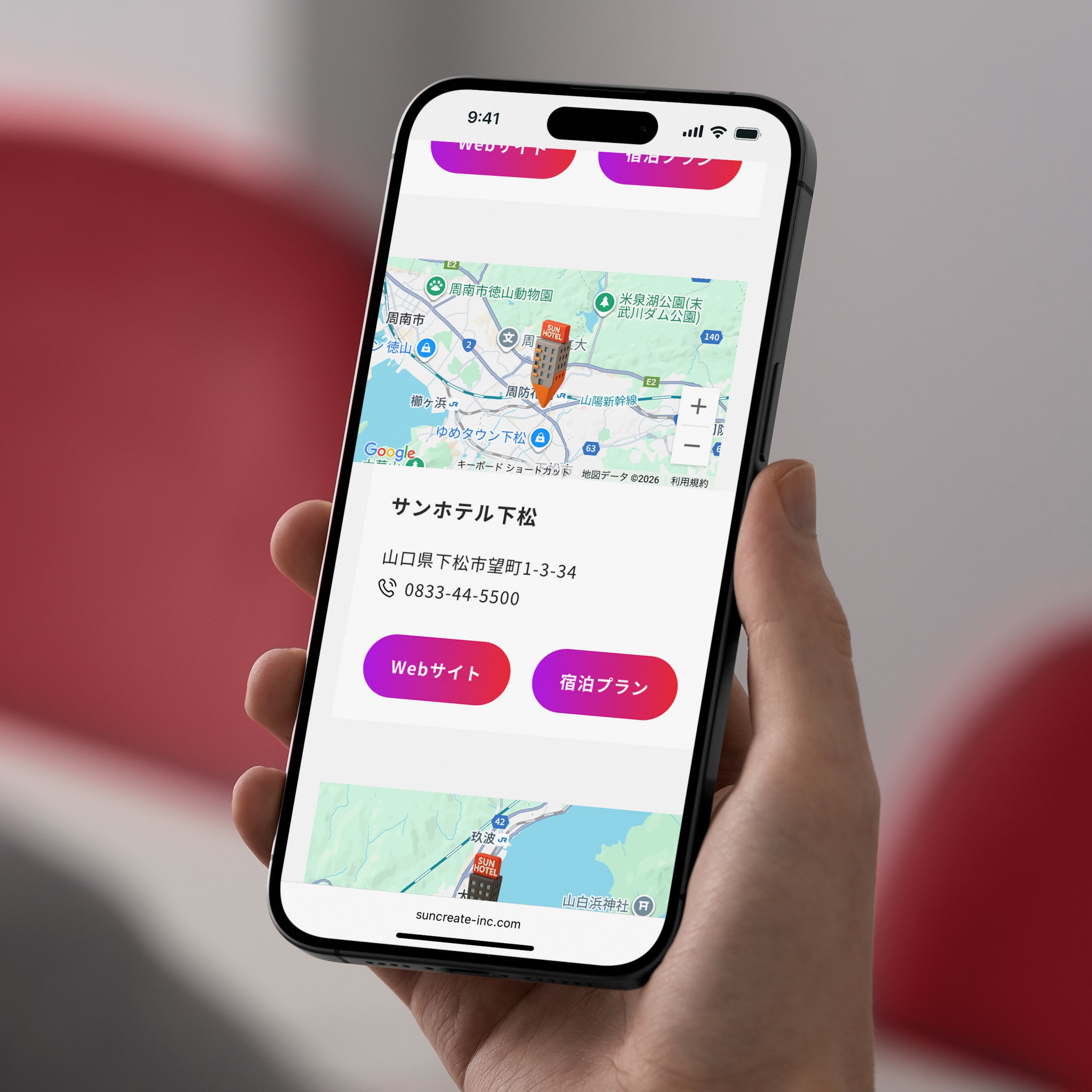
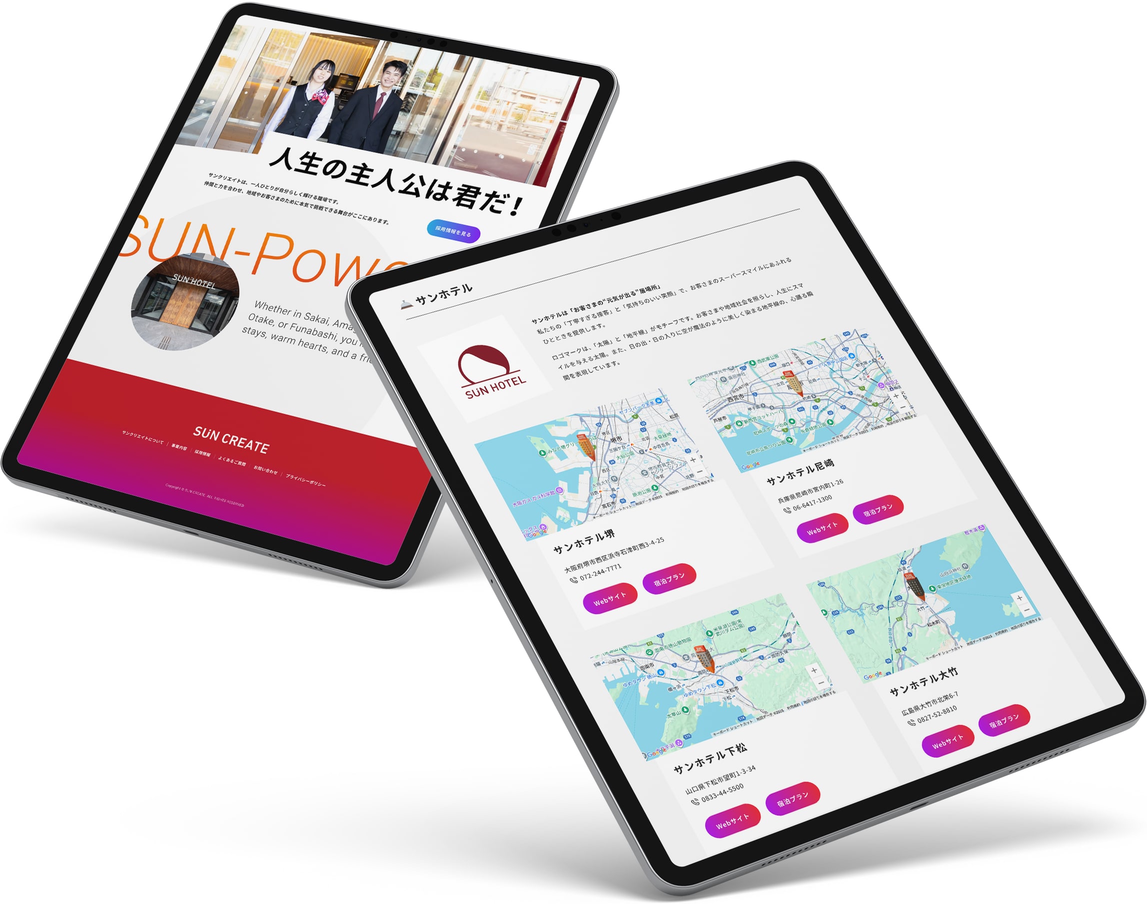
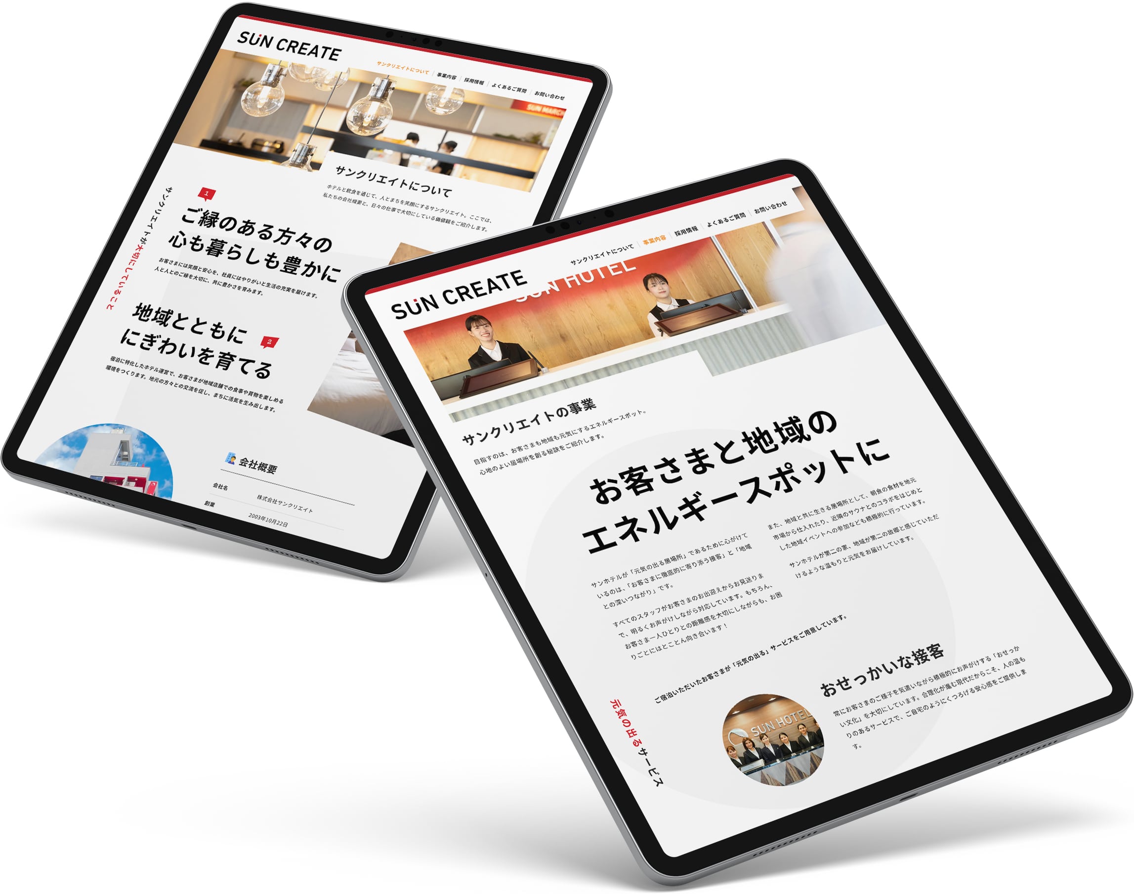
602様よりお声がけをいただき、ホテル運営会社・サンクリエイトのコーポレートWebサイトを制作しました。
企業としての信頼感を大切にしながら、サンクリエイトらしい「明るさ」「元気さ」「おもしろさ」が直感的に伝わる体験を目指しています。デザインコンセプトには、会社名やホテル名に含まれる「SUN(太陽)」を据え、ブランドストーリーとつながる一貫したビジュアルと世界観を構築しました。
色彩やレイアウト、タイポグラフィにはリズムと勢いを持たせ、サイトを開いた瞬間に前向きでエネルギーのある印象を与える一方、情報構造はシンプルに整理し、事業内容や企業情報をストレスなく把握できる設計としています。
また、採用ページではトーンを保ちつつ熱量を高め、「ここで働きたい」と感じられるワクワク感や企業文化が自然と伝わる構成としました。
ブランドの一貫性と企業サイトとしての信頼性、そして“元気の出る体験”を両立させたWebサイトです。
We designed and developed a new corporate website for Sun Create, a hotel management company.
The site balances corporate credibility with warmth and energy, reflecting the company’s open and positive character. Inspired by the word “sun” in the brand name, the design is built around a clear and cohesive visual theme. Bold colors, dynamic layouts, and expressive typography create a bright first impression, while a clean information structure ensures clarity and ease of use.
The recruitment section features a more energetic tone, highlighting company culture and inviting visitors to imagine working with the team.
Visit website — Japanese
Credits:
Producer: Kaoru Chono (602)
Project Managers: Kaoru Chono & Rieko Nakanishi (602)
Director / Designer: Hideki Owa (PULP)
Technical Director / Engineer: Kouhei Yamamoto (eggraphix)
Copywriters: Ikuko Noda & PULP
Photographer: Tomoaki Makino
Client: Sun Create
October 2025


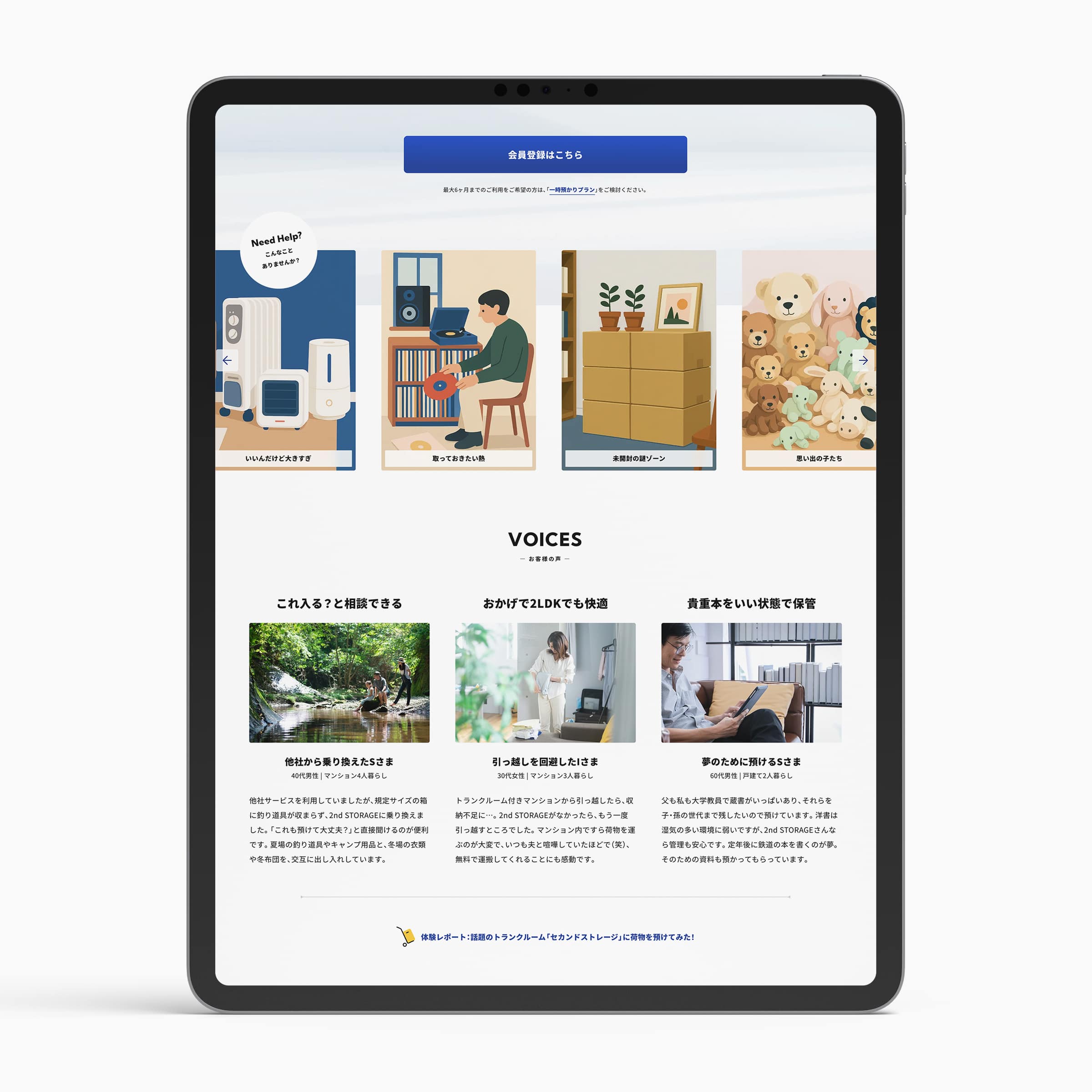
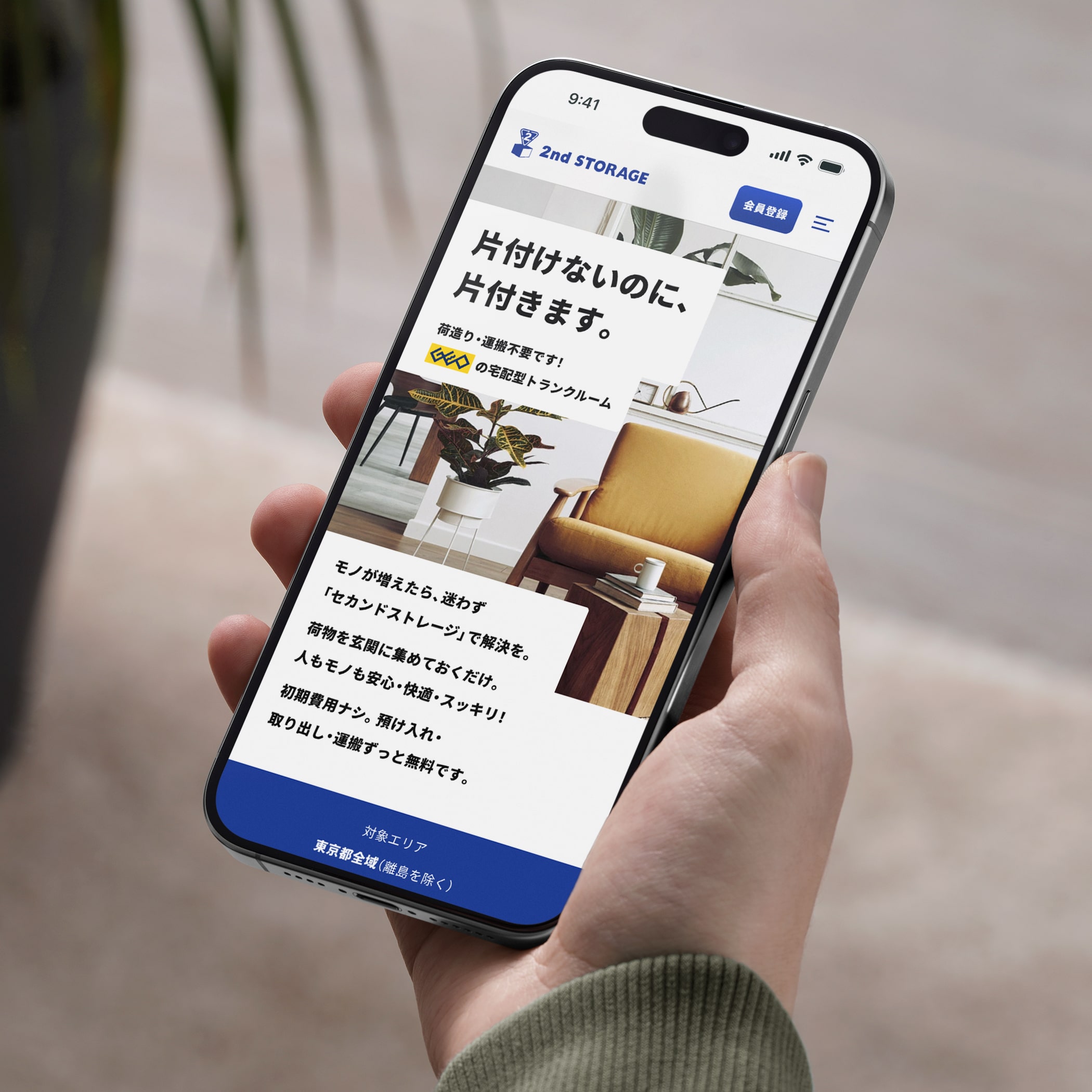
GEOグループが展開するトランクルームサービス「2nd STORAGE」の新しいランディングページ(LP)を制作しました。
2024年に公開したLPでは、ターゲットオーディエンスが共感しやすい情緒的価値を入口とし、サービスの利便性や安心感といった機能的価値、そしてキャンペーン特典へと段階的につなげる構成によって、利用者のニーズやペインポイントに応える体験を設計しました。
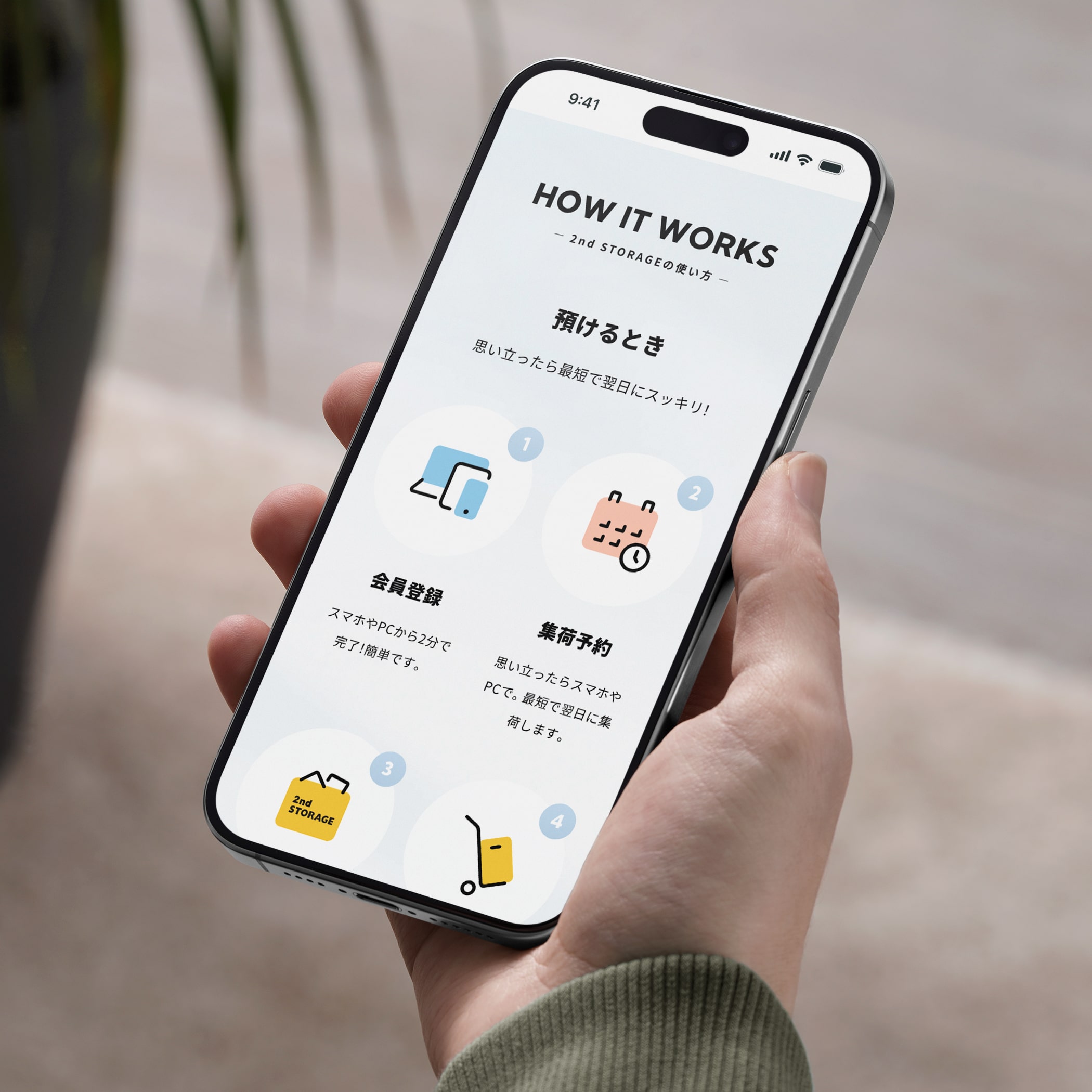
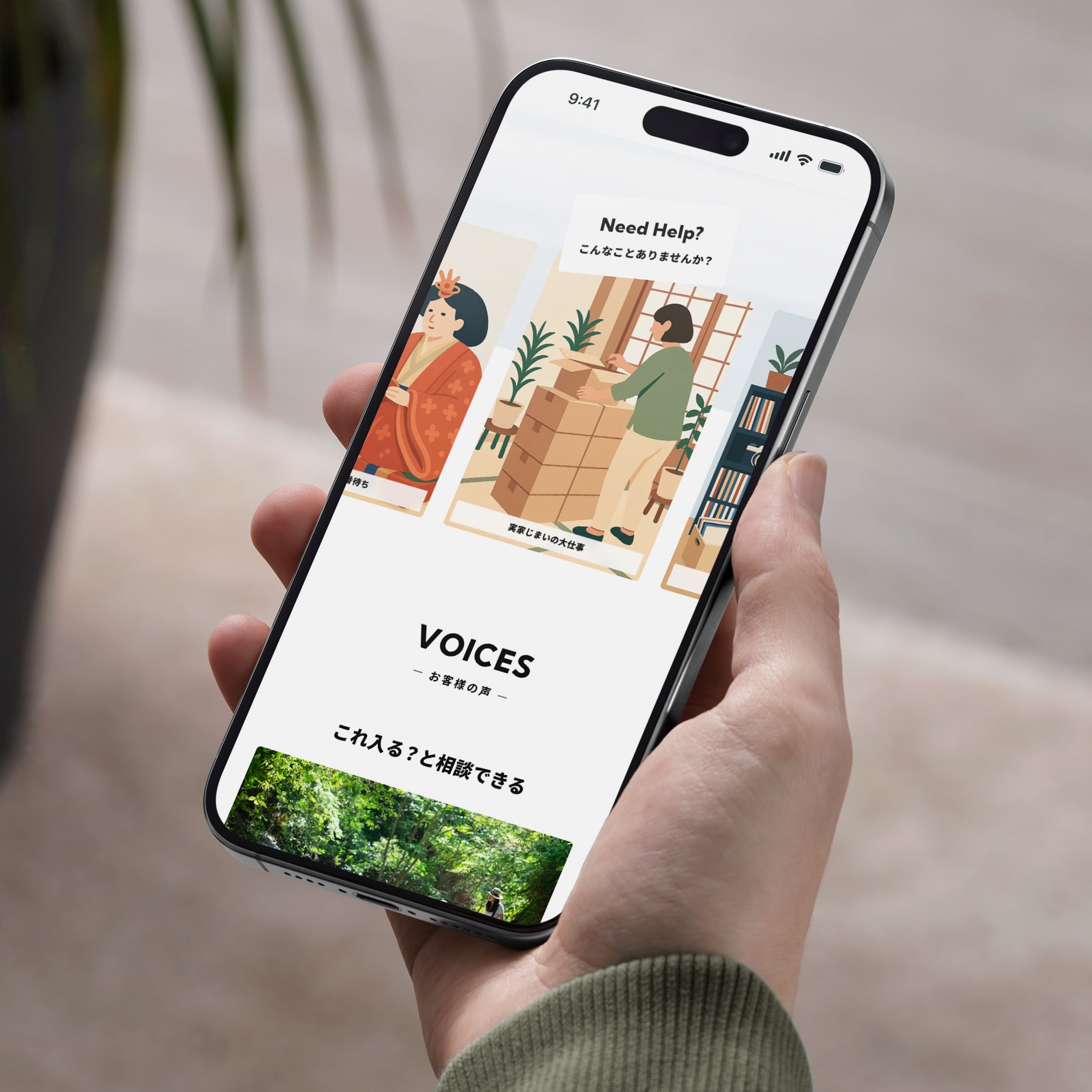
2025年版の新LPでは、価格や料金プラン、他社比較といった検討段階で重視される情報に加え、2nd STORAGEならではの特長や安全性、柔軟な契約プラン、ご利用方法、お客様の声、活用例などのコンテンツを拡充。機能的価値をより明確に、わかりやすく伝える構成へとアップデートしています。
一方で、機能面の訴求に偏るのではなく、「安心して使える」「自分の暮らしに合っていそう」と感じられる心理的な納得感も大切にしました。情緒的価値と機能的価値のバランスを取りながら、検討から行動へと自然につながる導線を設計しています。
新しいLPを通じて、より多くのユーザーに2nd STORAGEの価値を届け、サービス理解と利用率の向上を目指しました。
We designed a new campaign landing page for 2nd Storage, GEO Group’s self-storage service. Building on the 2024 launch, which led with emotional resonance before introducing functional benefits, the 2025 version shifts its focus toward clearer, more practical decision-making. Pricing, plan comparisons, key features, safety, and flexibility are presented alongside expanded content such as usage guides, customer voices, and real-world use cases.
Rather than prioritizing functionality alone, the new LP balances rational clarity with emotional reassurance — helping users feel both confident and comfortable choosing the service. The result is a page designed to support consideration, comparison, and action in a natural flow.
Through this update, we aimed to reach a wider audience while improving service understanding and conversion.
2024年に公開したLPでは、ターゲットオーディエンスが共感しやすい情緒的価値を入口とし、サービスの利便性や安心感といった機能的価値、そしてキャンペーン特典へと段階的につなげる構成によって、利用者のニーズやペインポイントに応える体験を設計しました。
2025年版の新LPでは、価格や料金プラン、他社比較といった検討段階で重視される情報に加え、2nd STORAGEならではの特長や安全性、柔軟な契約プラン、ご利用方法、お客様の声、活用例などのコンテンツを拡充。機能的価値をより明確に、わかりやすく伝える構成へとアップデートしています。
一方で、機能面の訴求に偏るのではなく、「安心して使える」「自分の暮らしに合っていそう」と感じられる心理的な納得感も大切にしました。情緒的価値と機能的価値のバランスを取りながら、検討から行動へと自然につながる導線を設計しています。
新しいLPを通じて、より多くのユーザーに2nd STORAGEの価値を届け、サービス理解と利用率の向上を目指しました。
We designed a new campaign landing page for 2nd Storage, GEO Group’s self-storage service. Building on the 2024 launch, which led with emotional resonance before introducing functional benefits, the 2025 version shifts its focus toward clearer, more practical decision-making. Pricing, plan comparisons, key features, safety, and flexibility are presented alongside expanded content such as usage guides, customer voices, and real-world use cases.
Rather than prioritizing functionality alone, the new LP balances rational clarity with emotional reassurance — helping users feel both confident and comfortable choosing the service. The result is a page designed to support consideration, comparison, and action in a natural flow.
Through this update, we aimed to reach a wider audience while improving service understanding and conversion.
Visit website — Japanese
Credits:
Producer: Miki Fukuda (人と暮らし)
Project Managers: Kaoru Chono & Rieko Nakanishi (602)
Director / Designer: Hideki Owa (PULP)
Technical Director / Engineer: Kouhei Yamamoto (eggraphix)
Copywriter: Aki Mineta
Client: 2nd STORAGE (GEO Holdings Corporation)
July 2025
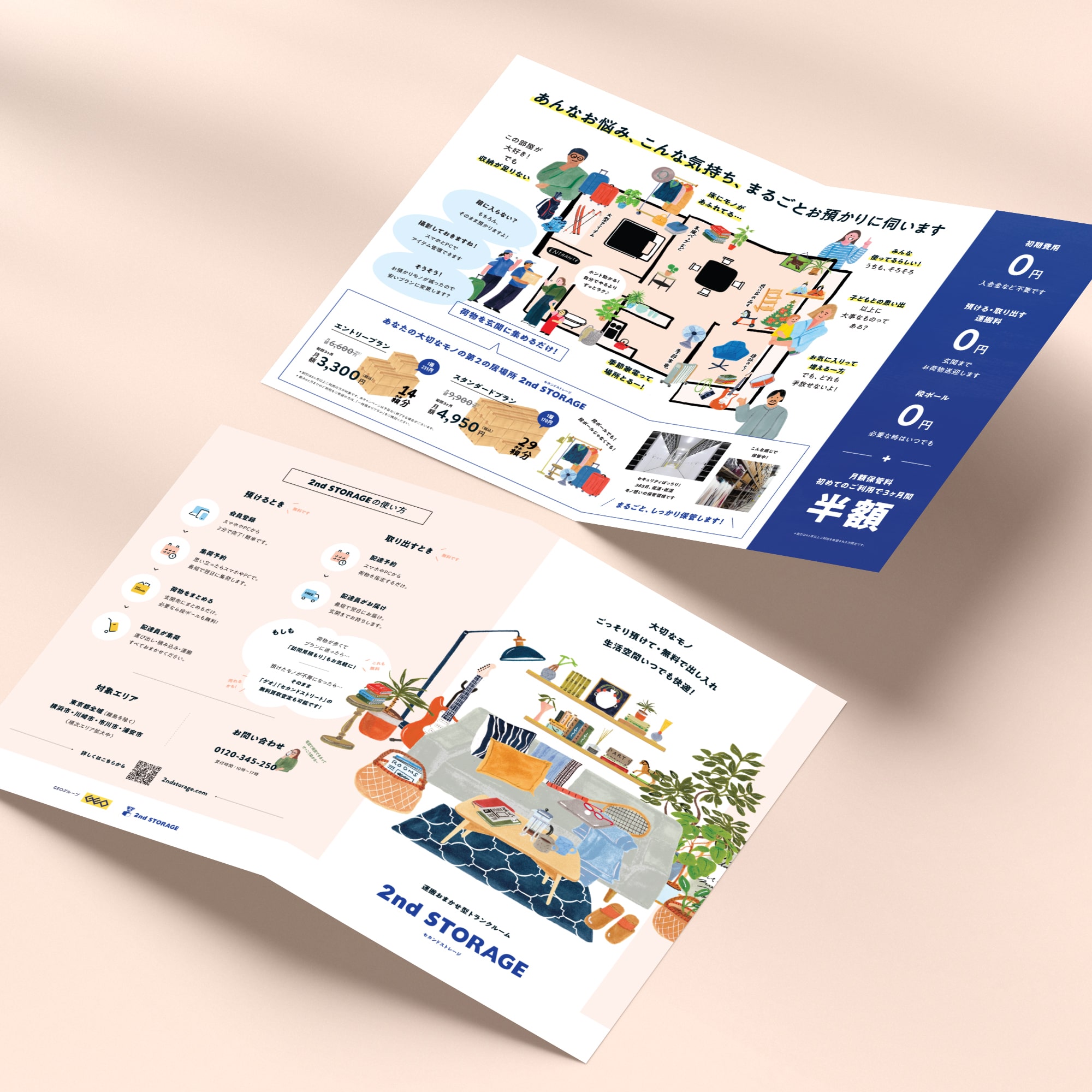
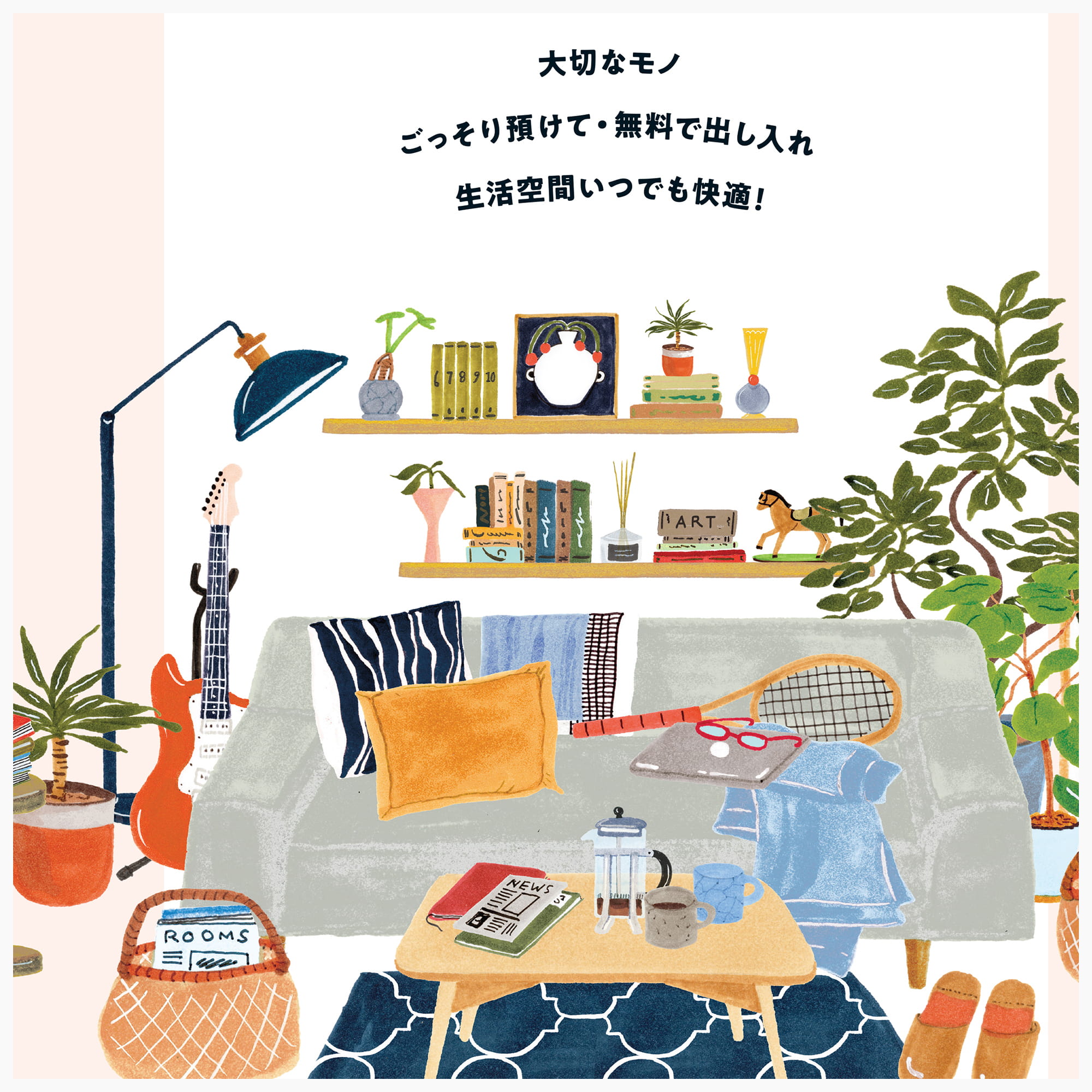
2024年度のキャンペーンWebサイトと連動し、イベント会場や各種タッチポイントにおいてサービスの魅力を直感的に伝えるリーフレットを制作しました。
暮らしの中に自然と溶け込むイラスト表現と、要点を整理した情報設計により、初めての方にも「自分ごと」として想像しやすい構成としています。Webと紙、それぞれの特性を活かしながら、一貫したブランド体験を設計しました。
A campaign leaflet was created in conjunction with the 2024 campaign website to communicate the service’s value in a clear and intuitive way. Through approachable illustrations and concise information design, the leaflet extends the campaign experience into print while maintaining a consistent brand tone across digital and physical touchpoints.
![]()
![]()
![]()
![]()
![]()
暮らしの中に自然と溶け込むイラスト表現と、要点を整理した情報設計により、初めての方にも「自分ごと」として想像しやすい構成としています。Webと紙、それぞれの特性を活かしながら、一貫したブランド体験を設計しました。
A campaign leaflet was created in conjunction with the 2024 campaign website to communicate the service’s value in a clear and intuitive way. Through approachable illustrations and concise information design, the leaflet extends the campaign experience into print while maintaining a consistent brand tone across digital and physical touchpoints.
Credits:
Producer: Miki Fukuda (人と暮らし)
Project Managers: Kaoru Chono & Rieko Nakanishi (602)
Director / Designer: Hideki Owa (PULP)
Copywriter: Aki Mineta
Illustrator: Grace Lee
Client: 2nd STORAGE (GEO Holdings Corporation)
November 2024